8 Ways to Elevate Your Website Pages with Crazy-Effective CTA Buttons (+Examples)
Dayana Mayfield
on
Sep 7, 2024
Have you ever clicked on a button that felt like it read your mind?
Well, it turns out there’s a reason why some websites make us feel that way. Personalized CTAs can perform 202% better than their basic counterparts. If you’re looking to boost your conversion rates, that’s a stat you can’t afford to ignore.
In this piece, we’re tapping into eight killer ways to boost your website pages by leveling up those CTA buttons.
Whether you’re looking to ramp up your sales or just want more folks interacting with your content, these tips are your goldmine. Plus, we’ll show you real-life examples so you can see exactly how it’s done.
Let’s get to it and make those buttons impossible to resist!
1. Hook with an Incentive
Everyone loves a good deal or a promise of value. Powering up your CTAs with incentives is a powerful way to grab attention and encourage action.
Offering immediate value with your CTA makes clicking through irresistible because people feel they’re getting something special out of the deal.
Here’s how to capitalize on this CTA type:
Highlight a clear, tangible benefit that answers the “What’s in it for me?” question right away.
It could be a free trial, a discount, or exclusive access – anything that adds extra value to the click.
Let’s take a look at how a successful brand implements this tactic the right way.
The real-world champion in this game is GetSafe, a company selling medical alert systems. Their main CTA button reads: “Try Risk-Free for 30 Days.” Why is it a knockout?
It hits the sweet spot by offering a no-strings-attached trial, removing the fear of commitment, and letting potential customers test the waters on their terms. The CTA works wonders because it reassures visitors, making the decision to click through and try their product a no-brainer. Visitors don’t see it as a mere button but as an invitation to experience their service worry-free.
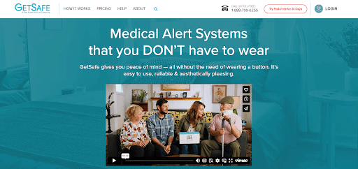
This approach not only increases conversions but also builds trust with their audience, showing that GetSafe stands behind the quality of their offers.
2. Say What You’ll Do
Clarity is so important in the digital realm. When visitors know precisely what clicking a button will do, they’re far more likely to take the leap.
This tactic is effective because it eliminates guesswork, aligns expectations, and streamlines the user journey. By being clear and direct, you significantly increase the likelihood of users taking the desired action.
Here’s how to get it right with a clear CTA:
Your CTA should act as a mini-instruction manual. Use words that leave no doubt about what happens next.
Whether it’s “Download Your Guide,” “Join Our Community,” or “Start Your Free Trial,” each command points the way forward, making the user’s path as straightforward as possible.
A shining example of this strategy comes from Startup Resources, a startup tools repository. Positioned next to their newsletter sign-up form is a CTA that reads “Get Startup Tools.”
This is brilliant for a couple of reasons:
Firstly, it’s laser-focused. People visiting Startup Resources are looking for exactly that – resources for startups.
The CTA tells them precisely what clicking will accomplish: access to a curated list of tools and resources sent weekly.
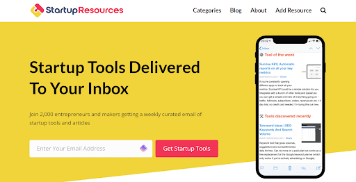
By employing this direct approach, Startup Resources effectively communicates the value of its offer and makes the action step clear and appealing. This boosts sign-ups while ensuring the audience knows exactly what they’re getting. That’s how the brand sets the stage for satisfaction and long-term engagement.
3. Stay on Brand
Brand identity can make or break the connection you have with your audience. Therefore, maintaining a consistent brand voice and aesthetic across all touchpoints, including CTA buttons, is non-negotiable.
It’s effective because it builds recognition and trust. When users feel familiar with your brand’s look and voice, they’re more likely to engage.
Here’s how to you ace it:
Consistency is key. Ensure that every element of your CTA, from the language to the colors and font, aligns with your brand identity.
Your CTAs are part of your brand story. Matching your brand’s tone and visual elements in your CTAs reinforces your brand’s personality and makes your message resonate more deeply with your audience.
TeuxDeux, a sleek to-do list app, masters this beautifully. Known for their minimalist design and approachable style, TeuxDeux uses a simple yet striking color scheme of white and violet.
Their CTAs follow suit, maintaining the same color palette and friendly wording to ensure consistency across their website.
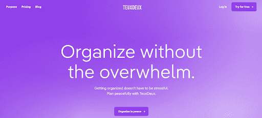
This disciplined approach to branding through their CTAs enhances visual appeal and fortifies their brand identity. When users interact with these CTAs, there’s no disconnect – the experience is fluid and unmistakably TeuxDeux.
By staying on brand, you too can deepen the overall engagement with your audience, encouraging them to make your product or service a part of their daily lives.
4. Use Action-Packed Wording
The right words can energize your audience and make your CTAs irresistible.
This approach is effective because it transforms a passive browsing experience into an active, engaging journey. It has the power to amplify your conversion rates by 121%.
By using verbs that convey enthusiasm and immediacy, you tap into the visitor’s desire to participate and make a difference.
Here’s how to persuade your prospects to take action:
Focus on verbs that pack a punch and create a sense of urgency or excitement.
Instead of generic phrases like “Click Here,” use dynamic language that paints a vivid picture of the benefits or experiences awaiting the user.
Words like “Discover,” “Unleash,” and “Transform” can light up a user’s imagination and encourage them to take action.
A prime example of doing this right is Prosperity Media, an SEO and digital PR agency. The CTAs on their Enterprise SEO Services and Solutions page cut right through the noise. They read “Work with Us” and “Let’s Chat” instead of the all-too-common “Sign Up” or “Start Here.”
This choice of wording makes a world of difference. It personalizes the experience, suggesting a collaborative journey rather than a transactional interaction.

This approach piques curiosity about what lies beyond the click and aligns with the agency’s ethos of partnership and personalized service.
By adopting action-packed wording, you can invite potential clients into a dialogue, making the prospect of reaching out feel less like a commitment and more like an opportunity for growth and collaboration.
5. Address Your Customers Directly
Employing first-person pronouns like “I,” “we,” and “you” is a method that fosters a conversational tone, making the user feel seen and understood. It’s effective because direct address cuts through the digital divide, creating a one-on-one dialogue with the user.
This approach builds rapport and makes the call to action feel like a personal invitation rather than a generic prompt.
Here’s how to directly address your customers:
Involve more than just some personal pronouns. It’s about crafting messages that resonate with the user’s needs, desires, and challenges.
Speak as if you’re having a conversation with them in the same room.
Use “you” to speak directly to the user, and “we” to include yourself in the journey, making it a shared experience.
ProofHub, a project management and team collaboration software, masters this technique with their CTA – “Start your free trial.” This CTA embodies a personal invitation from ProofHub to the user, suggesting a partnership in tackling project management challenges.
By using “your,” they make it clear that the trial is tailored for the individual user, enhancing the feeling of a bespoke experience. This personalized approach is reassuring and compelling, making the user more likely to engage.
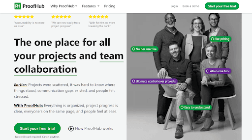
This direct address strategy makes ProofHub’s CTA stand out by emphasizing a collaborative and user-centric experience. They suggest starting not just a trial but a journey together, making the user feel valued and included from the outset.
6. Be Smart with the Colors
The psychology of color in web design is closely tied to the art of making CTAs pop.
Colors influence mood and behavior, making this strategy important and highly effective. The right color can grab attention, convey a message, and significantly boost click-through rates by standing out and appealing directly to the user’s emotions and instincts.
Here’s how to leverage the right colors for your CTAs:
Choose colors that contrast well with your site’s overall design to ensure your CTAs jump off the page.
But you can’t just pick any bright color. You’ve got to select a color that also aligns with your brand and the action you want the user to take.
For instance, red can evoke urgency and excitement, making it a great choice for a “Buy Now” button, while green, associated with success and positivity, might be better suited for a “Get Started” CTA.
Academic Influence, a platform ranking schools and degree programs, uses this strategy by using deep red for its main CTAs. This choice is strategic for several reasons.
Red is a color that converts the best and creates a stark contrast against the platform’s other design elements. This ensures the CTAs practically command attention.

This thoughtful use of color underscores the importance of visual cues in guiding user behavior and enhancing the effectiveness of web design.
7. Place Them Logically
The right placement of your CTAs can dramatically increase the likelihood of user action because it aligns with the natural browsing flow.
It’s effective because it capitalizes on user expectations – people expect to find certain actions in specific places. When your CTAs are where users instinctively look for them, you reduce friction, making it easier and more likely for users to take the desired action.
Here’s how to do this right:
Consider the user’s journey on your page. Place CTAs at points where users are most likely to have made a decision or need guidance on what to do next.
This could be next to relevant information that supports the CTA’s purpose, at the end of impactful content, or in locations that are traditionally known for interaction, like the top right corner of a webpage or the end of a form.
Australian Business For Sale, a website for business listings, exemplifies smart CTA placement. Their homepage header includes a search tool for finding businesses for sale, with a CTA placed right next to it.
This positioning is logical and intuitive. Users coming to the site are likely in search of business listings, so placing the search CTA prominently next to the search tool aligns perfectly with the user’s immediate goal.
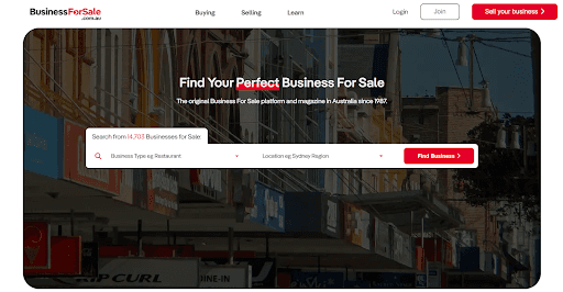
By placing the CTA where users most expect and need it, you can optimize the user experience and streamline your prospects’ path to action.
8. Think About the Button Shape
The shape of a CTA button can affect how users perceive it. Sharp edges can convey precision and modernity, while rounded edges are often seen as friendly and approachable.
This detail is vital because even small differences in design can influence a user’s decision to engage. The trick lies in creating a button that stands and aligns with your brand’s personality and user expectations at the same time.
Here’s how to pick the right button shape:
Experiment and test. Analyze your website’s overall design and user flow, then create variations of your CTA buttons to see which shapes achieve higher conversion rates.
Use an A/B testing tool like Optimizely to help identify which design resonates best with your audience.
Time Doctor, a workforce analytics platform, showcases the successful implementation of this strategy. Their CTA buttons feature an innovative design with one sharp edge and three rounded corners, making them highly distinctive.
This unique shape catches the eye, ensuring the CTAs are easily recognizable amidst a sea of information. The unconventional design draws attention and aligns with Time Doctor’s brand identity as innovative and user-focused.

By thoughtfully considering button shape and embracing uniqueness, Time Doctor enhances the visibility and effectiveness of their CTAs, demonstrating the power of design details in driving user engagement.
Final Thoughts
Now that you’ve got the insider scoop on crafting compelling CTAs, it’s time to put these tips to work and see how they perform.
Remember, the right tweaks can turn passive browsers into active participants. Don’t wait – start testing and refining your CTAs today to unlock their full potential.
Previous post: