20 Website Footer Examples to Inspire Your Design [+ Top Tools]
Dayana Mayfield
on
Apr 21, 2026
Ah, the humble website footer: the unsung hero of web design. It’s where brands wrap up their content, stash the fine print, and—sometimes—surprise you with a little extra flair. From well-known giants like Amazon to your favorite neighborhood sandwich shop, a great footer ties the digital experience together like a bow on a perfectly wrapped gift (or like the bottom bun of your burger… gotta keep that content sandwich stable!).
In this post, we’ve rounded up 20 stellar website footer examples that prove this overlooked section can pack a punch. Whether you’re looking for inspiration for clean design, smart organization, or killer CTAs, you’ll find it all here. Plus, we’ll throw in some top tools to help you craft a footer that shines—because your website deserves to end on a high note. Let’s dive in and give those footers the love they deserve!
What every great website footer needs
The examples below will give you tons of inspiration. Try to hit on these key elements in your own website footer.
1. Clear navigation links
A footer should act as a secondary menu, helping users quickly find key pages once they reach the bottom. It improves usability and reduces friction, but stuffing it with too many links, poor grouping, or simply duplicating the main menu without structure can overwhelm users instead.
2. Contact information
Including email, phone, or location builds trust and makes it easy for users to reach you, signaling legitimacy. However, relying only on contact forms, leaving details outdated, or omitting key channels like email can create frustration and reduce credibility.
3. Social media links or feed
Social links extend engagement beyond your site and help users stay connected with your brand, while a live feed can add freshness. That said, linking to inactive profiles, cramming in too many platforms, or embedding heavy feeds that slow the page can do more harm than good.
4. Legal pages (privacy policy, terms)
These pages protect your business and show users you handle data responsibly, making them essential for compliance and trust. Hiding them in hard-to-find areas, using outdated policies, or ignoring region-specific requirements can raise red flags.
5. Branding element
Your logo, tagline, or brand colors reinforce identity and leave a lasting impression at the end of the page. If branding feels inconsistent, cluttered, or lacks clear visual hierarchy, it can weaken recognition instead of strengthening it.
20 great website footer examples
Restructure the examples with H3 categories by business type rather than a numbered list: SaaS & Tech, Ecommerce, Agency & Portfolio, Nonprofit, Personal/Blog. For each example, include what specific element makes it effective, not just a screenshot or description
SaaS & Tech
1. Hootsuite
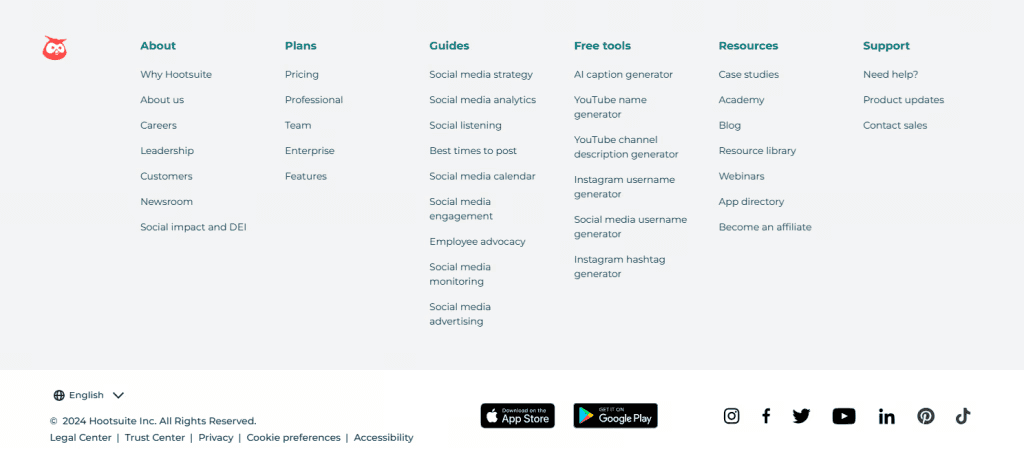
What makes it effective is its multi-column structure that balances product, resources, and tools, guiding both prospects and users without friction. It works because everything is logically grouped, though less structured footers at this scale can quickly feel overwhelming.
2. Buffer
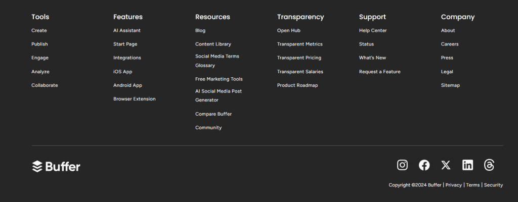
Its standout element is the Transparency section, which builds trust by openly sharing metrics and company details. Many brands skip this level of openness, making their footers feel purely functional instead of credibility-building.
3. Testlio
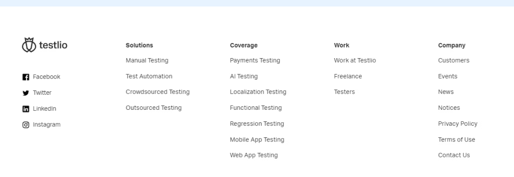
The footer excels with a clean, role-based navigation (Solutions, Work, Company) that speaks to different audiences. Without this clarity, SaaS footers often become cluttered catch-alls.
4. Juuno
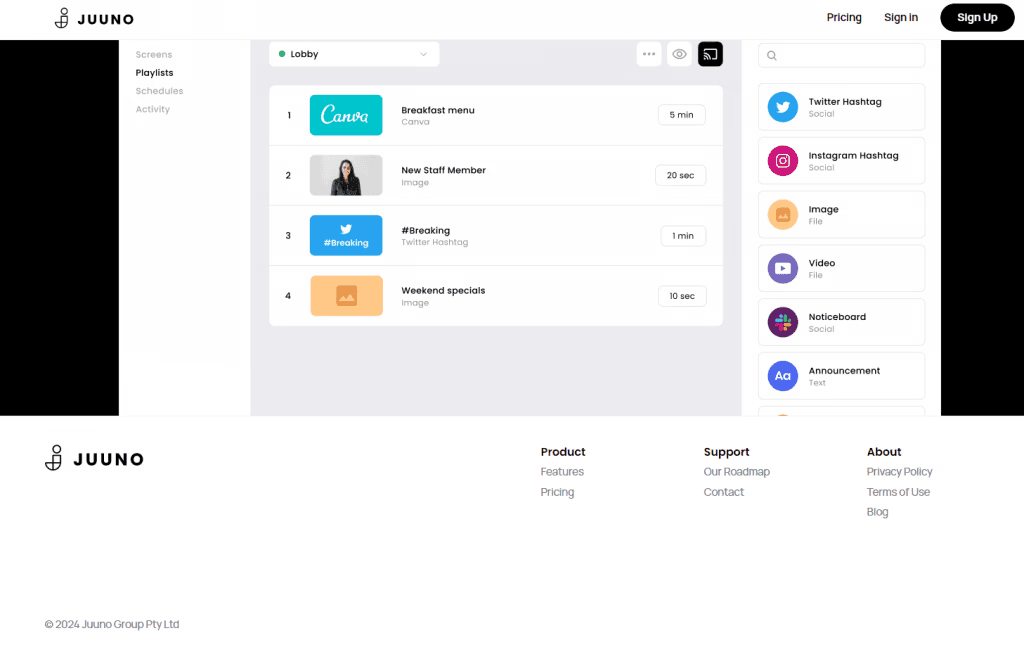
Juuno's strength is minimalism with a clear sitemap, proving that fewer, well-chosen links can improve usability. Overloading a small product footer would dilute this clarity.
Ecommerce
5. Amazon
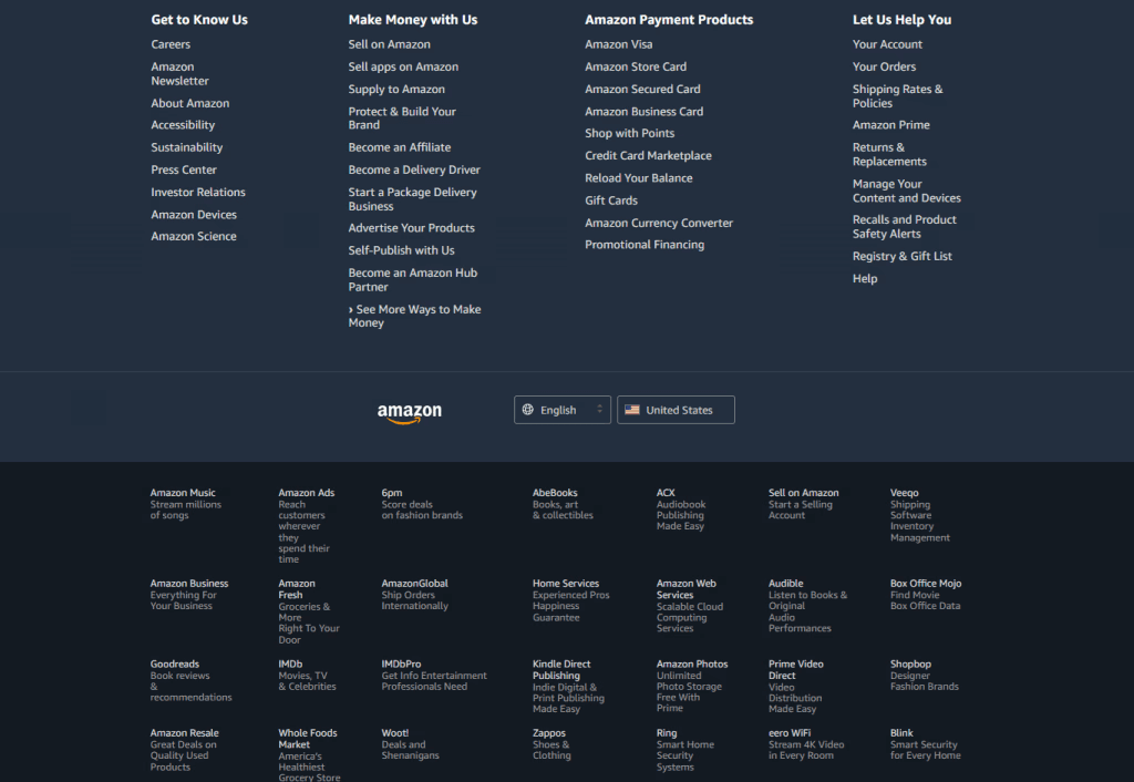
What stands out in this website footer example is its layered organization of massive content into digestible sections, making even a huge ecosystem navigable. This footer design website approach shows how structure prevents overwhelm, while still functioning as a simple website footer experience through clear categorization. Without that structure, even strong website footer examples like this would feel chaotic.
6. Tarte Cosmetics
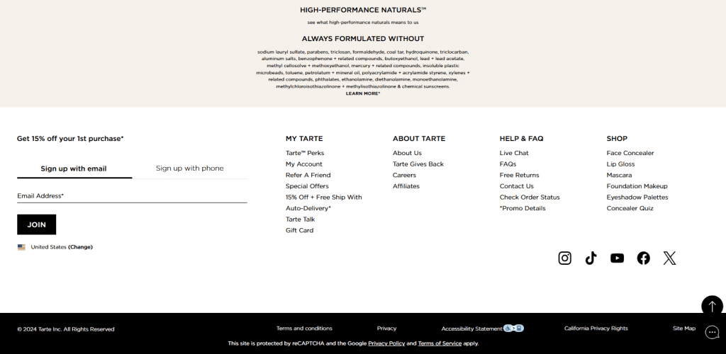
A strong website footer example, Tarte’s standout element is the “Formulated Without” transparency section, which reinforces brand values while users browse. Many ecommerce footers miss this chance to communicate what makes the brand different.
7. Petco
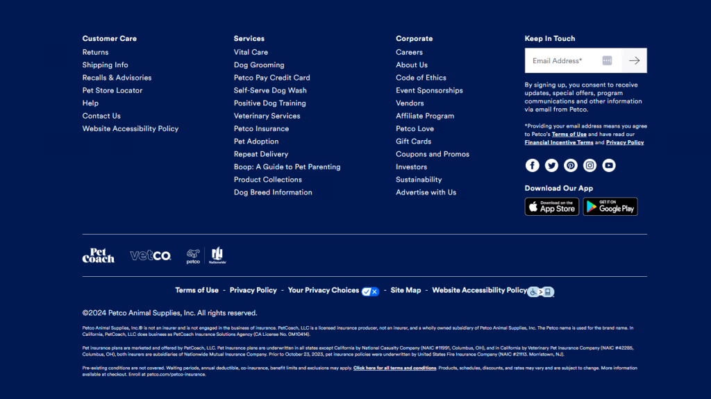
Its effectiveness comes from utility-driven sections like Customer Care and Services paired with app and newsletter CTAs, helping users take action quickly. Skipping these would reduce conversions.
8. MidwayUSA
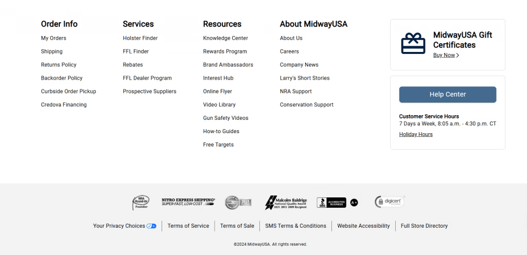
The standout feature is the prominent Help Center with service hours, which reduces support friction. Many stores bury support details, making assistance harder to access.
9. Barnes & Noble
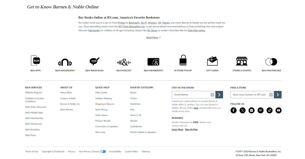
It works because of feature-rich navigation (categories, services, store locator) that mirrors how customers browse. Without this, discovery across such a large catalog would suffer.
10. Mattel
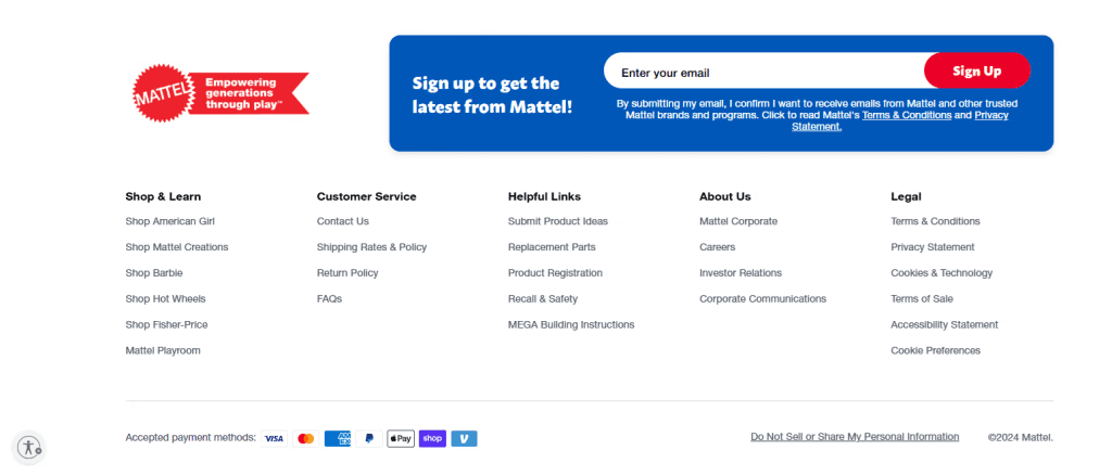
Mattel’s website footer example shines with brand-level navigation like Barbie and Hot Wheels, helping users jump into product ecosystems. Skipping this brand segmentation would make exploration slower.
11. Manic Panic
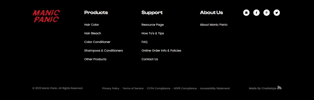
The effectiveness comes from tight, three-column simplicity aligned with brand identity, keeping things bold and focused. Overcomplicating it would clash with the brand’s edgy tone.
12. Wine Club of the Month
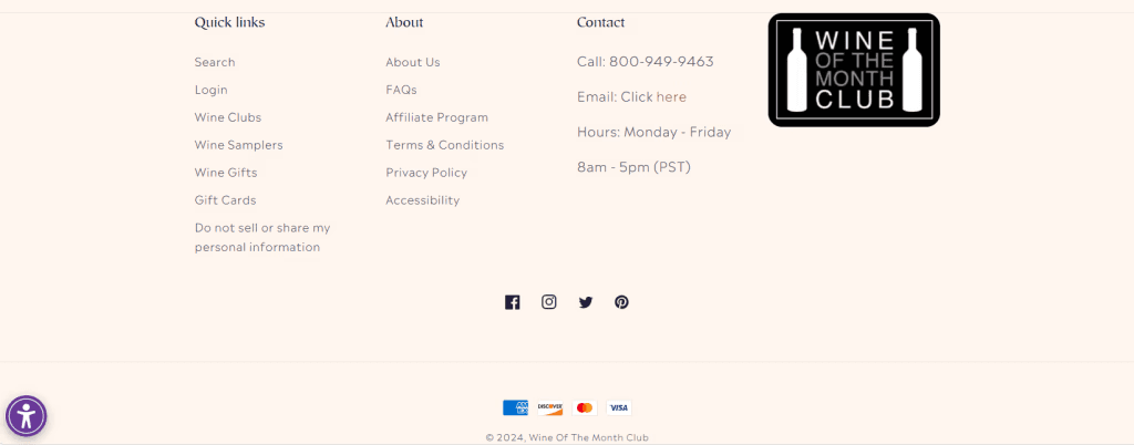
The key element is clear contact details with hours plus quick shopping links, blending trust and usability. Many ecommerce sites overlook business hours, which can frustrate customers.
13. Chipotle
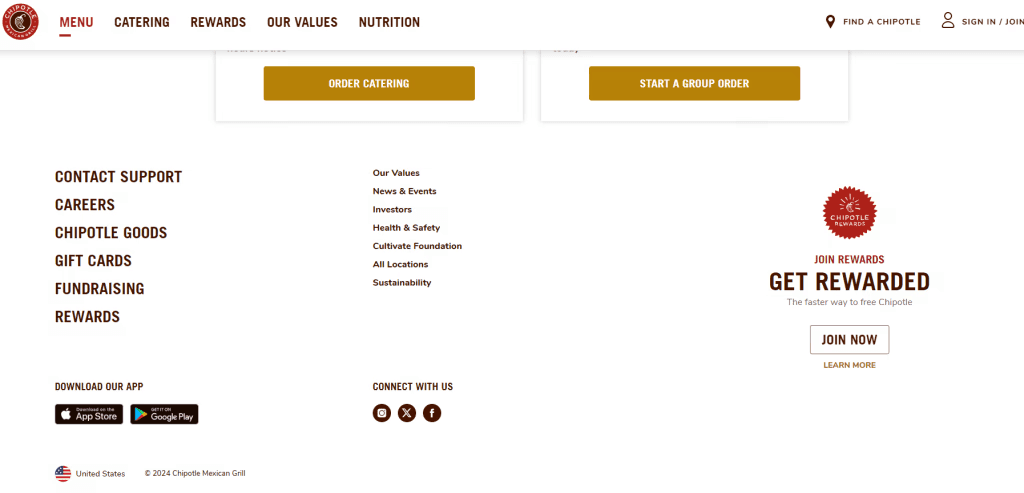
It works because of its clean, intuitive sections paired with brand values and rewards CTA, blending navigation with engagement. Overloading it would undermine its simplicity.
14. Maria’s Restaurant
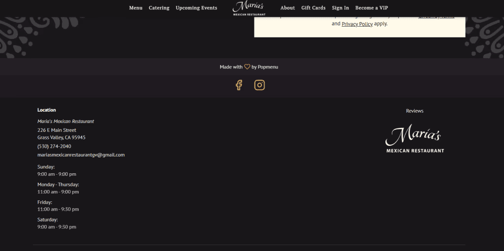
What makes it effective are its minimalistic design and straightforward contact details and hours, giving users exactly what they need to visit. Missing or unclear info here would directly impact foot traffic.
15. Mundo’s Sandwich Shop
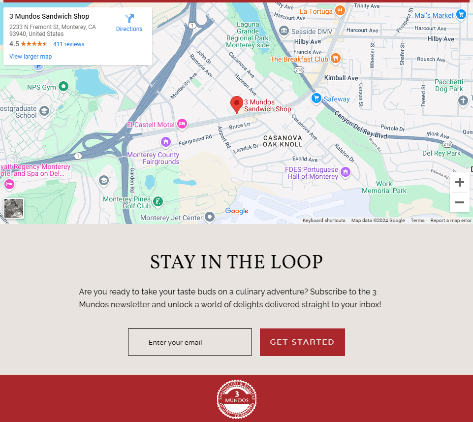
This website footer design example goes a step further with a Google Maps embed plus newsletter CTA, combining discovery with retention. Without location clarity, local businesses risk losing walk-in customers.
Media
16. Lainey Wilson
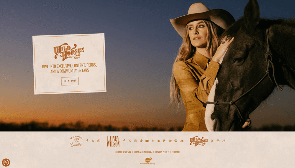
What makes it effective is the aesthetics and fan-focused CTA (fan club) paired with social links, turning the footer into an engagement hub. Without a clear next step, fans would simply drop off.
17. Girl Power Marketing

The footer stands out for its clear contact details, visible social media links, and simple layout, making it easy to trust, connect, and take action.
18. People
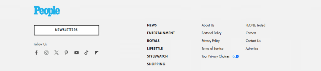
The footer works because of a strong newsletter CTA anchored in content categories, turning casual readers into subscribers. Without a clear CTA, traffic would leave without converting.
Nonprofit
19. Newport Aquarium
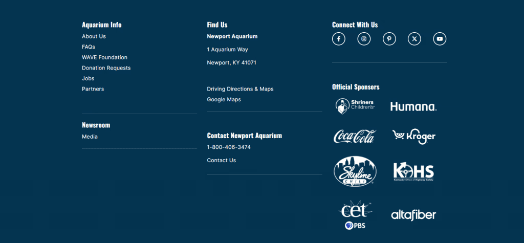
Its clear visitor logistics (address, directions, contact) and sponsor visibility build trust. It also makes things easier for people who plan to visit. Missing these details would create friction for visitors.
20. Calvary Presbyterian Church
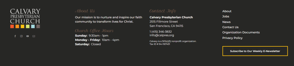
The mission statement combined with contact info and newsletter CTA in the simple website footer reinforce purpose while driving engagement. Many nonprofits miss this balance between storytelling and action.
The top 3 tools for updating your website's footer
These software platforms offer multiple ways to update your website's footer. With these tools, you can get multiple widgets and integrations in one place.
1. Curator
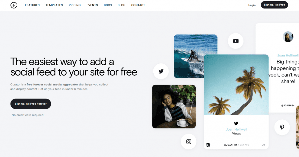
Curator is a powerful, free social media aggregator tool designed to help brands seamlessly display social media feeds on their websites. Whether you want to showcase your Instagram feed, embed user-generated content, or curate a wall of love, Curator simplifies the process with its intuitive interface and customization options. It supports over a dozen social media platforms, making it the perfect tool for enhancing your website’s engagement and boosting your brand's online presence.
Key features:
Free Forever Plan - Curator offers a free forever plan with no credit card required, making it accessible for businesses of all sizes.
Multi-Platform Support - Aggregate feeds from Instagram, Facebook, Twitter (X), YouTube, Pinterest, TikTok, LinkedIn, and more.
Easy Customization - Choose from various templates like Grid, Waterfall, Carousel, and Mosaic to perfectly match your website's branding.
Automated & Manual Moderation - Moderate your content effortlessly with options for automated approval or manual review of posts to keep your feed on-brand.
Quick Setup - Embed your social feed in under 5 minutes with a simple copy-paste HTML code.
Diverse Use Cases - Use Curator to display announcements, customer testimonials, behind-the-scenes content, and event promotions.
SEO Benefits - Boost your site's freshness and rankings by dynamically updating your website with social media content.
2. Elfsight
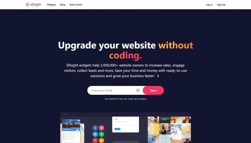
With Elfsight, you get a versatile, no-code platform offering a wide range of customizable widgets to enhance your website’s functionality and user engagement. From showcasing customer reviews to embedding social media feeds, Elfsight simplifies website customization, making it easy to keep your footer and other site sections up-to-date. Trusted by over 2 million website owners, Elfsight’s ready-to-use widgets save time, boost conversions, and enhance user experience across multiple platforms like WordPress, Shopify, Squarespace, Wix, and more.
Key features:
Extensive Widget Library - Over 80+ customizable widgets including social media feeds, customer reviews, forms, pop-ups, and more.
Social Media Integration - Embed content from platforms like Instagram, Facebook, Twitter, LinkedIn, Pinterest, and TikTok seamlessly into your footer.
Review Widgets - Display reviews from Google, Yelp, TripAdvisor, Facebook, Amazon, and other platforms to build trust and credibility.
No Coding Required - Easy-to-use editor for customizing widgets, allowing you to embed them on your site in just a few clicks.
Cross-Platform Compatibility - Works with popular website builders like WordPress, Wix, Squarespace, Shopify, and more.
Real-Time Updates - Automatically update widgets with new content, keeping your footer fresh and engaging without manual effort.
Performance Analytics - Monitor widget performance metrics to see how they contribute to your site’s goals.
3. Common Ninja
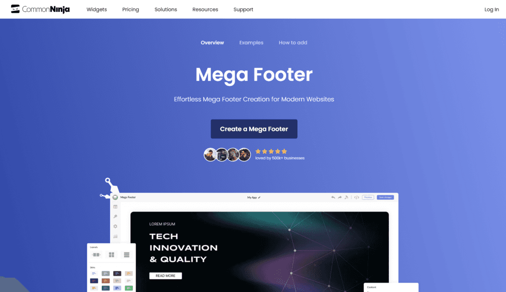
Common Ninja is a versatile no-code platform offering a wide range of widgets to elevate your website’s design and functionality. It provides essential tools like testimonial sliders, social media icons, and the innovative Mega Footer widget, which allows you to create organized and visually appealing footers packed with useful links, social icons, and branding elements. Whether you're updating a basic footer or creating an elaborate one with multiple sections, Common Ninja’s widgets make the process quick and easy, enhancing both aesthetics and user experience.
Key features:
Mega Footer Widget - Create a structured footer with multiple columns, integrated social media links, logos, and organized site navigation.
Testimonial Sliders - Display customer reviews dynamically with customizable slider options to build trust and engagement.
Social Media Icons - Easily embed clickable social media icons in your footer to encourage visitors to follow your brand.
Customizable Design - Fully personalize widgets with options for fonts, colors, spacing, and even custom CSS.
User-Friendly Interface - Intuitive no-code editor for quick customization and embedding, suitable for all skill levels.
Cross-Platform Compatibility - Compatible with major platforms like WordPress, Shopify, Wix, Squarespace, and more.
Responsive Design - All widgets are optimized for mobile, tablet, and desktop devices, ensuring a seamless user experience.
SEO-Enhanced Footers - Improve site structure and SEO by efficiently organizing footer links and content.
The ultimate list of things you can add to your website footer
Here's a list of items to consider adding to your footer. Local businesses should prioritize location and hours information. Consumer brands should focus on conversion and customer service. And if your using WordPress, there are some really great footer widgets available.
Contact Information – Phone number, email, or a contact form link for easy reach.
Social Media Icons – Links to your Instagram, Facebook, LinkedIn, TikTok, or other platforms.
Copyright Notice – Protect your content with the current year and your business name.
Privacy Policy – A link to your privacy policy to meet legal requirements.
Terms of Service – Ensure visitors know the rules for using your site.
Newsletter Signup – Invite users to stay updated by subscribing to your emails.
Business Hours – Display your working hours for customer convenience.
Physical Address – Include your location, especially if you run a brick-and-mortar business.
Site Map – Help visitors navigate quickly with a clear link map.
FAQs – Address common questions right from the footer.
Call-to-Action (CTA) – Encourage visitors to join your rewards program or subscribe.
App Download Links – Buttons for downloading your app on iOS or Android.
Testimonials/Reviews – Showcase customer feedback to build trust.
Legal Disclaimers – Important notes like affiliate disclosures or liability disclaimers.
Accessibility Statement – Demonstrate your commitment to inclusivity.
Quick Links – Shortcuts to key pages like About, Services, or Blog.
Map Widget – Embed a Google Map for easy directions.
Payment Methods – Display accepted payment options (Visa, PayPal, etc.).
Certifications and Badges – Highlight awards, security seals, or affiliations.
Social Media Feed – Dynamically display recent social posts using a tool like Curator.
Current website footer design trends
Across all five trends, the shift is clear: footers are no longer just “end-of-page” elements. They’re becoming conversion points, navigation hubs, and engagement tools, blending usability with interaction.
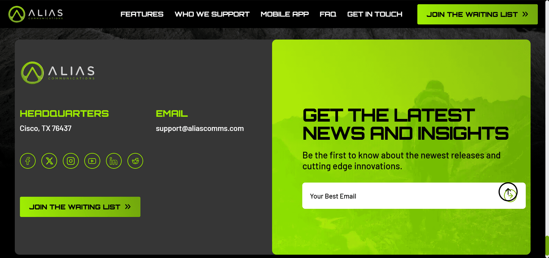
1. Dark mode footers
Dark mode footers are everywhere in 2026 because they reduce eye strain and create strong visual contrast, especially for long-scroll pages. For example, Alias Communications’ footer uses a dark background with high-contrast CTAs and social links, making key actions stand out while maintaining accessibility.
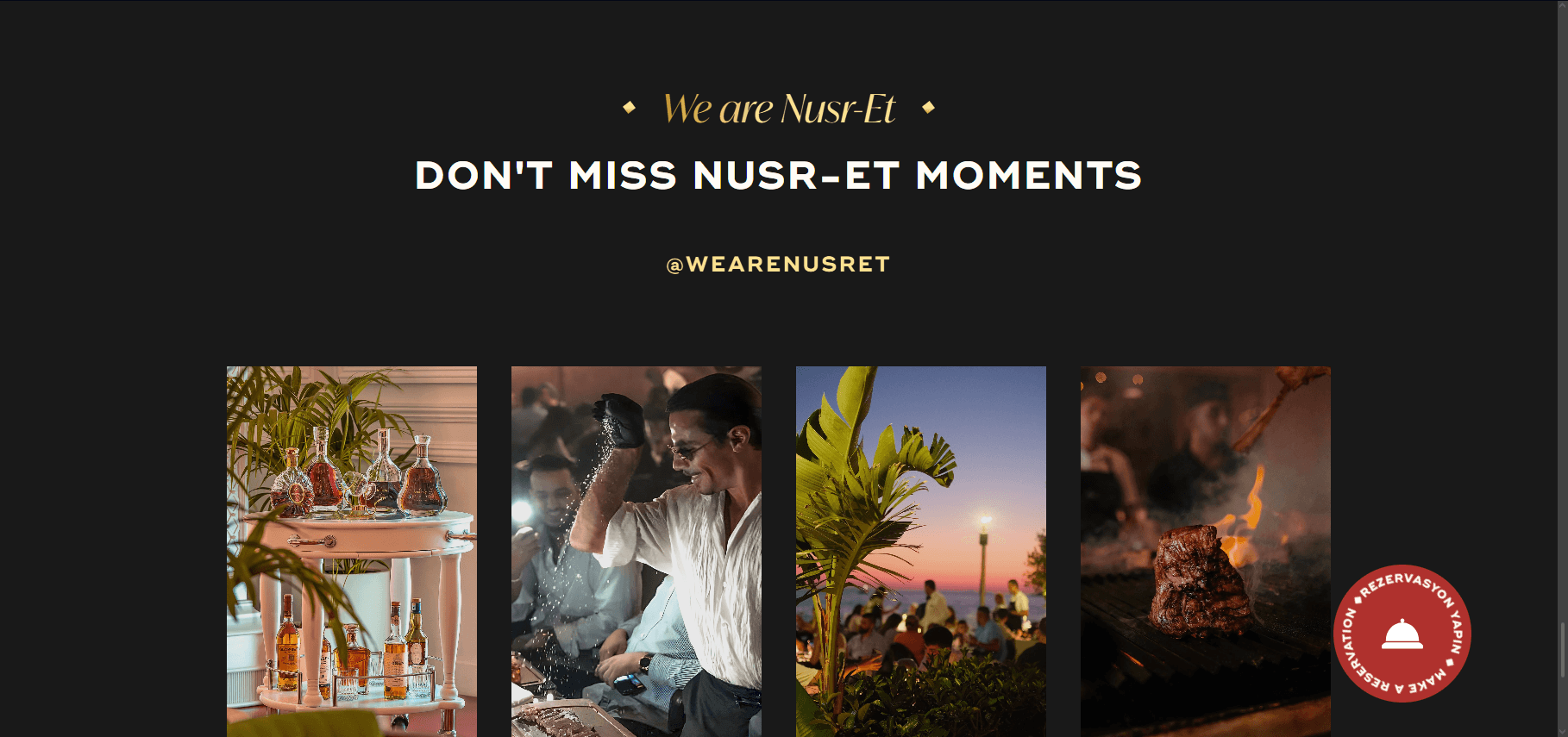
2. Embedded social media feeds
Footers are no longer static. They now pull in live content like posts, videos, or testimonials to keep the page dynamic and engaging. On Nusr-Et’s website, you’ll find an Instagram feed embedded in the footer. It turns the bottom of the page into a visually engaging showcase of real-time content, encouraging users to explore, follow, and stay connected.
3. Minimalist single-row footers
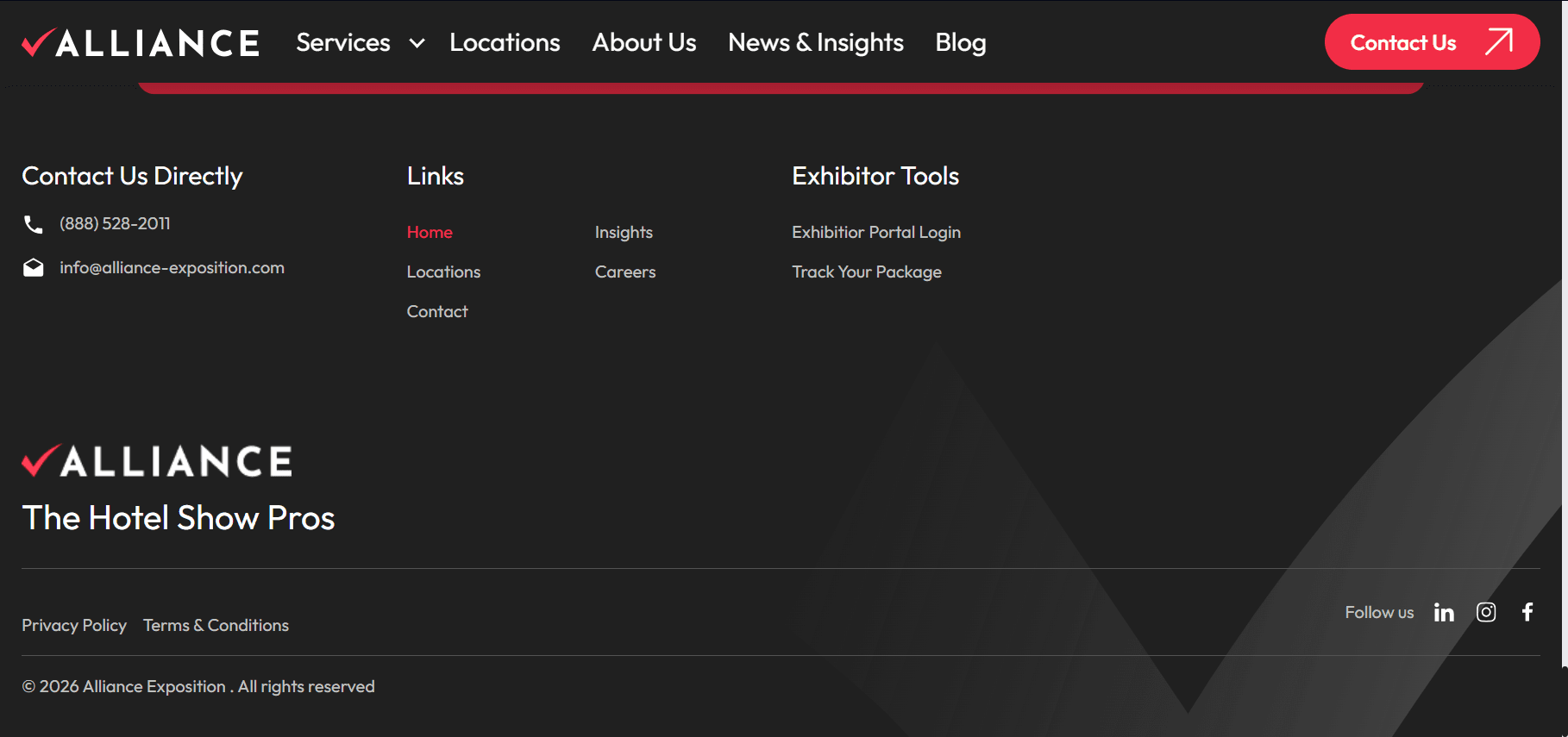
Minimalism continues to dominate, with brands stripping footers down to only essential links, logos, and legal info for faster scanning. Just look at Alliance Exposition’s simple website footer that keeps things simple with key links, contact info, and branding in a clean layout.
4. Animated micro-interactions
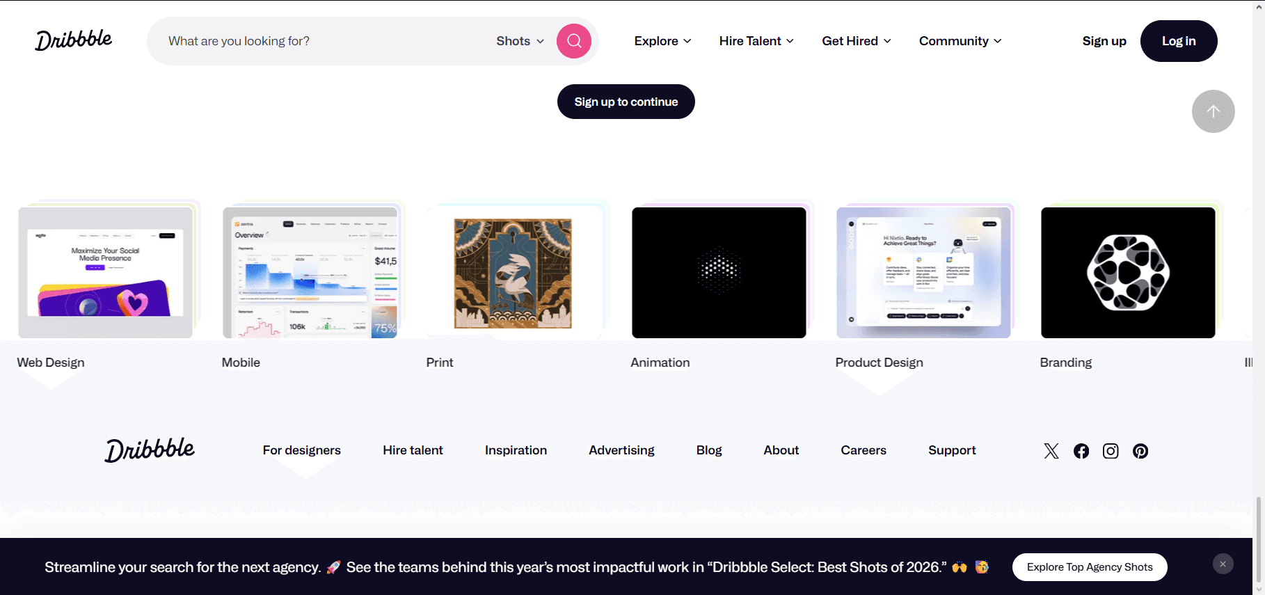
Subtle animations, like hover effects, moving icons, or background visuals, are turning footers into interactive experiences rather than static endpoints. Dribbble is a website footer example that does this well with the interactive links at the bottom of its site.
5. Sticky footers
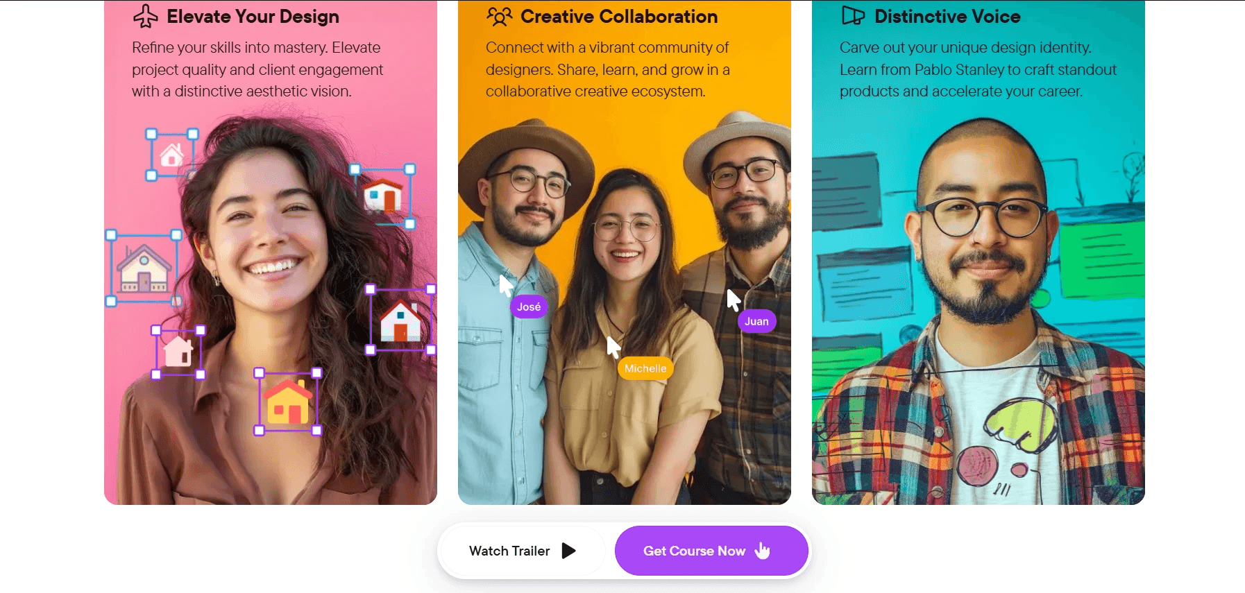
Sticky footers stay visible at the bottom of the screen, ensuring access to key links, CTAs, or contact info at all times, especially on mobile. Together Art’s website footer stays with you as you scroll, ensuring you don’t have to scroll to the bottom to buy their course.
Website footer checklist
A strong website footer design helps users navigate, builds trust, and improves conversions. Use this website footer checklist to make sure your footer is effective and search-friendly.
Clear navigation links to important pages like About, Services, and Contact
Accurate contact information including email, phone, and address
Social media links that lead to active, updated profiles
Legal pages such as privacy policy, terms, and cookie policy
Branding elements like logo and tagline for recognition
Newsletter signup or CTA to capture leads
Help or support links like FAQs or help center
Mobile-friendly layout for easy scrolling and tapping
Fast-loading design without heavy or unnecessary embeds
Regularly updated links and information
Frequently asked questions about website footers
What should every website footer include?
Every website footer should include clear navigation links, contact information, social media links, legal pages like privacy policy and terms, branding elements, and a CTA such as a newsletter signup. These improve usability, trust, and overall site engagement.
How many links should a footer have?
A footer can include 10 to 30 links, depending on the site’s size. Smaller sites need fewer, focused links, while large platforms can include more. The key is clear grouping, as too many unorganized links reduce usability and overwhelm users.
Should a footer have social media links?
Yes, a footer should include social media links because they help users connect with your brand beyond the website. They also build trust and engagement. Just ensure the links lead to active, regularly updated profiles to avoid hurting credibility.
What is a sticky footer?
A sticky footer is a website footer that stays visible at the bottom of the screen as users scroll. It improves accessibility, keeps key links available, and enhances navigation on long pages.
How do I edit my website footer?
If using WordPress, you can edit your footer through the WordPress Customizer under Appearance > Customize, or by using a theme builder like Elementor or Divi. For more control, manage widgets in the Dashboard > Appearance > Widgets. If you’re tech-savvy, add custom code in the footer.php file (but back up your site first!). Don’t want to code? Use a footer plugin like Curator or Header Footer Code Manager to simplify customization. Other website builders (like Wix, Shopify, and Squarespace) operate similarly, where you can add widgets to the footer section.
Easily add a social media feed like Instagram, X, or TikTok to your website's footer with Curator. Try our free forever plan.
Previous post: