19 Inspiring Wall of Love Examples [+ How to Make Your Own]
Dayana Mayfield
on
Apr 22, 2026
Customers don’t just buy products. They buy trust. And today, that trust is built on reviews. In fact, 85% of consumers hesitate to consider a product without online reviews, while 97% read reviews of a local business before even stepping through the door. The impact goes beyond perception too. Conversion rates peak at a 4.9-star rating and can increase by as much as 270% when retailers display five or more reviews.
But it’s not just the reviews themselves that matter. How you present them plays a major role in their effectiveness.
Turning positive feedback into a visually engaging, easy-to-browse experience can influence buying decisions at scale. Thoughtfully showcasing testimonials, customer stories, and other user-generated content (UGC) helps build credibility while guiding potential customers toward action.
That’s where a wall of love comes in. It brings scattered praise into a curated, compelling display that highlights what people genuinely love about your brand. In this guide, we’ll explore standout wall of love examples, break down what makes them effective, and give you the inspiration to create one that turns customer admiration into conversions.
What is a wall of love (no, not the Paris version)?
A wall of love is a section on a website dedicated to showcasing customer testimonials, positive reviews, and social media shoutouts. Unlike the Paris Wall of Love, which is a physical mural celebrating romance, this digital version highlights the love and appreciation your customers have for your brand. It serves as a powerful tool for building trust and credibility by featuring real, authentic feedback from your satisfied clients.
The benefits of adding a wall of love to your website
Adding a wall of love to your website is more than just showcasing customer testimonials; it’s about building a stronger connection with your audience. This powerful tool can enhance your brand’s credibility and create a more engaging experience for visitors. By featuring genuine feedback and positive experiences, you create a sense of community and trust that can drive customer loyalty and attract new clients. Here are some of the key benefits:
Build trust through customer experiences
Improve relationships with existing customers
Engaging previous customers promotes repeat business
Create a community experience around your brand
Improve your business profile
Increase conversion rates by leveraging social proof
Enhance your brand’s online presence
Provide potential customers with relatable success stories
This approach not only enhances the user experience but also contributes to a more dynamic and interactive website. This in turn leads to increased customer satisfaction and business growth.
Types of wall of love content
This content comes in many different forms. These are the most popular sources for walls of love.
1. Customer reviews (Google, G2, Trustpilot)
Verified reviews from platforms like Google, G2, and Trustpilot add instant credibility. They show real customer experiences in a format buyers already trust. Featuring a mix of short quotes, star ratings, and detailed feedback helps prospects quickly understand your product’s strengths.
3. Social media praise (Twitter/X, Instagram mentions)
Social media mentions capture unfiltered, real-time reactions. Tweets and Instagram posts often feel more authentic because they’re unsolicited. Curating these into shareable snippets, visual cards, or wall of love photos makes your website’s review page or section more dynamic and relatable.
4. Slack shoutouts (direct customer messages)
Private messages from customers, whether through Slack or support channels, often contain some of the most genuine praise. These candid shoutouts highlight real wins and can humanize your brand when presented thoughtfully. When creating a Slack wall of love from private content, always make sure to get permission.
5. Video testimonials
Video testimonials bring stories to life. Seeing and hearing customers talk about their experience builds trust faster than text alone. Short, well-edited clips can significantly boost engagement and conversions.
6. Email praise
Positive customer emails are another goldmine. They tend to be more detailed and personal, making them perfect for storytelling. Displaying these emails on your wall of love helps turn private praise into public proof that builds trust and influences buying decisions.
19 wall of love examples to inspire your own
Are you ready to have your own testimonial wall? Here are some examples for inspiration.
1. Buffer's social love wall

Buffer's wall of love stands out by displaying the concise benefits stated by its users. The design is clean and clearly portrays the benefits the brand provides. Each post includes the user’s handle which makes it feel personal and authentic. Buffer also ensures that the testimonials cover various aspects of their service.
Key takeaways:
Scrolling carousel display creates a dynamic experience
User handles add a personal touch
Testimonials highlight different aspects of the product
Clean, minimalist design
2. Notion’s user stories

Utilizing their testimonials to highlight how different individuals and teams use the platform, Notion’s wall of love features a diverse collection of user stories. The stories are accompanied by visuals that showcase the customizability of Notion’s templates and layouts. Each testimonial emphasizes how Notion has improved productivity and organization for its users. They also include quotes from CEOs and managers of major brands which adds to their authority.
Key takeaways:
Diverse range of use cases highlighted
Emphasis on customizability and productivity
Visuals that showcase Notion’s unique layouts
Positive quotes from executives of major brands
3. Dribble’s wall of love
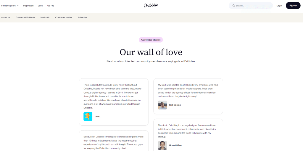
Dribbble showcases a wall of love that features testimonials from designers and companies praising the platform's impact on their creative journeys. The page highlights various success stories. These stories emphasize how Dribbble has helped users connect with clients, share their work, and gain recognition in the design community. The layout of the testimonials is simple yet visually engaging. This makes it easy for visitors to see the value of joining the Dribbble community.
Key takeaways:
Highlights success stories from designers and companies
Emphasizes connections made through the platform
Visually engaging layout that showcases user experiences
Focuses on the benefits of gaining recognition in the design community
Builds credibility through authentic user testimonials
4. Zapier's testimonial quotes

Zapier keeps their wall of love simple and short with impactful quotes from users. Each testimonial is accompanied by the user’s name and handle, adding credibility. The layout is straightforward, ensuring the focus remains on the customer feedback. The continuous scrolling feature also keeps you engaged with the testimonials as they drift by.
Key takeaways:
Short, impactful quotes keep it concise
User names and handles add credibility
Simple layout that emphasizes testimonials
Continuous scrolling carousel format engages visitors
5. Shopify's success stories
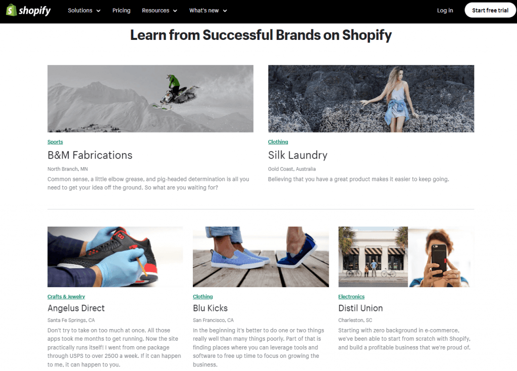
Shopify’s wall of love features extensive case studies from successful businesses using their platform. The case studies are detailed, including both written and video content, and they often highlight how Shopify has helped these businesses grow.
Key takeaways:
Detailed case studies offer comprehensive insights
Combination of written and video content
Focus on business growth and success
6. Relume’s community love page
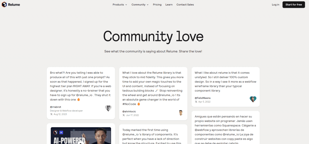
Relume’s wall of love reviews utilizes a simple waterfall format to showcase heartfelt testimonials from their community of designers and developers. The page combines X and YouTube messages and links to share the customer success stories around the platform’s support in creating websites faster and more efficiently. The page highlights various success stories, featuring feedback from users who have integrated Relume’s library into their workflow. The testimonials emphasize how Relume has enhanced productivity, creativity, and collaboration within the web design community.
Key takeaways:
Highlights success stories from designers and developers
Emphasizes increased productivity and efficiency
Focus on how the platform enhances creativity and collaboration
Authentic testimonials from a passionate user base
Builds a strong sense of community and shared success
Elegant waterfall design format
7. Buy Me a Coffee’s wall of love
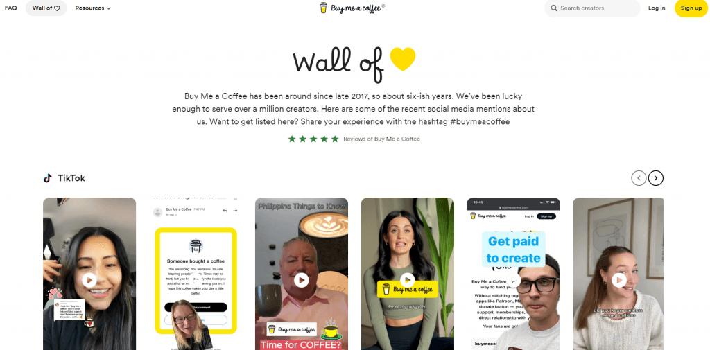
Combining TikTok, X, and YouTube, Buy Me a Coffee fills their wall of love with reviews and testimonials from creators and supporters alike. The page features a mix of written reviews and video testimonials, highlighting how the platform has helped creators receive support from their audiences. The wall of love is simple yet effective. It showcases the genuine appreciation and positive experiences of both creators and supporters.
Key takeaways:
Features a mix of written reviews and videos
Highlights the platform's impact on creator support
Simple, straightforward design focused on testimonials
Emphasizes the mutual appreciation between creators and supporters
Builds trust through authentic user feedback
Clickable carousel format allows you to flow through the reviews at your own pace
8. Intercom's customer shoutouts
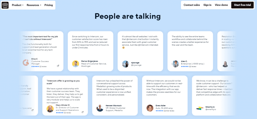
Intercom’s wall of love showcases in-depth case studies from companies that have seen significant improvements using their platform. They also include a scrolling two row carousel social media feed highlighting what the users are saying. The stories are backed by data and the posts include a lot of linked reviews. This results in an incredible level of authority and trust.
Key takeaways:
Data-driven case studies provide measurable results
In-depth storytelling offers detailed insights
Focus on tangible improvements for businesses
Eye catching two-row, reverse scrolling carousel social feed
9. Asana's wall of love
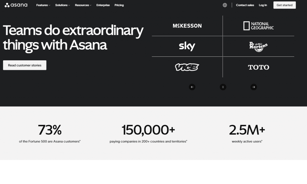
With a focus on customer stories, Asana’s wall of love highlights testimonials from a wide range of industries. They showcase how different teams use their tool for project management. The testimonials are diverse, and the page includes a search function that makes it easy for visitors to find relevant stories. They also categorize their case studies by features such as industry and company size so visitors can connect to stories that are relevant and transition to customers.
Key takeaways:
Diverse range of industries represented
Search function for easy navigation
Focus on team collaboration and project management
Over 140 customer stories
10. Agorapulse’s happy customers

Agorapulse features a wall of love that showcases testimonials and case studies from businesses that have successfully leveraged their social media management tools. The page includes stories from a variety of industries. These stories highlight how Agorapulse has streamlined social media workflows, improved engagement, and provided valuable analytics. Many of the testimonials are accompanied by specific results which helps demonstrate the platform's tangible impact on business growth.
Key takeaways:
Showcases a diverse range of industries using the platform
Highlights improvements in social media workflows and engagement
Emphasizes tangible results with specific case studies
Focus on the impact of analytics and performance tracking
Builds credibility through detailed success stories
Interactive page supports engagement
11. Basecamp's love letters
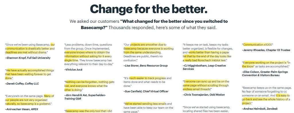
When they asked their customers “What changed for the better…,” Basecamp received thousands of responses. So they made a wall of love filled with these “love letters” from customers who appreciate the simplicity and effectiveness of their project management tool. The page is a very simple format, but impresses as you continue to scroll and scroll through all of the positive feedback.
Key takeaways:
Simple format with highlighted text exemplifies the positive message
Focus on simplicity and effectiveness
Quirky, fun design
Easy to connect with and find value
12. Mixpanel’s testimonial wall
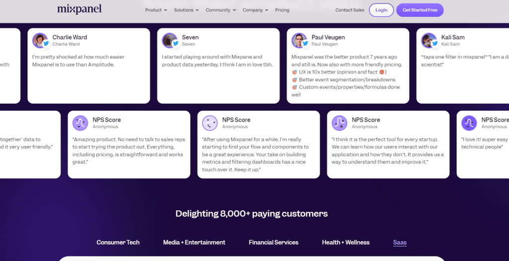
Mixpanel utilizes X mentions, testimonial quotes, reviews, and industry specific case studies into their wall of love. The customer stories are from a variety of companies that have used their analytics platform to drive data-driven decision-making. The page highlights the diversity of businesses that have leveraged Mixpanel to understand user behavior, optimize product features, and boost customer engagement. The testimonials are backed by real-world results, showcasing the platform’s ability to deliver actionable insights that lead to growth and innovation.
Key takeaways:
Focuses on data-driven decision-making and user behavior insights
Highlights diverse use cases across various industries
Emphasizes the optimization of product features and customer engagement
Scrolling carousel social feed creates engaging content
Real-world results provide tangible evidence of success
Builds credibility through detailed and impactful customer stories
13. Miro's customer stories

Miro has combined quotes, video testimonials, and use cases into a full wall of love. They showcase stories from teams that use their digital whiteboard for collaboration and innovation. The testimonials highlight specific use cases, showing how Miro enhances team productivity and creativity.
Key takeaways:
Focus on collaboration and innovation
Highlights specific use cases
Emphasis on team productivity and creativity
14. Bonsai’s reviews page
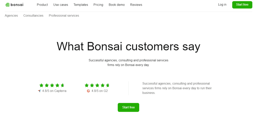
The reviews page on Bonsai’s platform presents user testimonials in a clean, minimalist design that aligns with the brand’s professional aesthetic. The layout is simple and easy to navigate. Each review is prominently displayed to ensure clarity and readability. The page uses subtle color accents and ample white space to create a focused and user-friendly experience. This makes it easy for visitors to quickly grasp the value of the platform.
Key takeaways:
Clean, minimalist design that aligns with the brand’s aesthetic
Simple, easy-to-navigate layout
Prominent display of each review for clarity and readability
Subtle color accents complement the overall design
Effective use of white space to enhance focus and usability
15. OpenVC’s wall of love
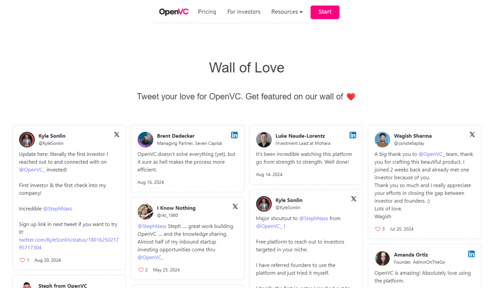
OpenVC’s wall of love features a collection of testimonials from startup founders and investors. These testimonials are pulled from X, Pinterest, and LinkedIn and presented in a clean and modern waterfall design format. The page is organized to allow easy navigation, with testimonials displayed in a visually appealing format. The layout highlights key quotes and includes a call to action to get their users posting about them.
Key takeaways:
Clean and modern design with a waterfall layout
Easy navigation and well-organized
Visually appealing presentation of testimonials
Professional yet approachable page design
16. Zendesk’s customer stories page

The customer stories page of Zendesk showcases testimonials and case studies in an organized, scrollable layout. The format makes it easy for visitors to browse through different success stories and find the content that resonates with them. The page uses easy filtering to help visitors find relevant case studies. Each customer story is presented in a dedicated section that stands out through bold headings and vibrant visuals. The design is both professional and user-friendly.
Key takeaways:
Visually organized, scrollable layout for easy browsing
Dedicated sections for each customer story with bold headings
Effective use of images alongside text for visual appeal
Professional and user-friendly design
Engaging presentation
17. 99designs reviews and rating

99designs’ testimonials page presents customer feedback in a visually striking, list-style format. Visitors can easily navigate and filter through different testimonials. The design features large, bold typography and vibrant images that draw attention to each client’s experience. Displaying the high rating with high quality customer testimonial video is a compelling way to engage visitors and demonstrate the value of the company.
Key takeaways:
List-style format for easy navigation through testimonials
Bold typography enhances visual appeal
Dynamic and engaging presentation of customer feedback
Visually striking design that captures attention
18. Postmark’s love reviews
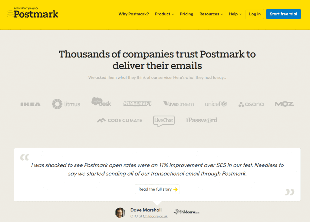
Utilizing their reviews, Postmark features their customer support in quote captions. The positive feedback is effectively highlighted in these customer testimonials. Each testimonial is presented in a simple card style that makes it easy to read and navigate. The testimonials are a mix of short quotes and longer feedback with several links to customer success stories. Their wall of love provides a well-rounded view of customer satisfaction. The use of consistent typography and subtle color accents helps maintain a professional look while keeping the focus on the content.
Key takeaways:
Clean and straightforward design with a semi-waterfall format
Simple card style presentation for easy readability
Mix of short quotes and longer, detailed testimonials
Consistent typography for a professional appearance
Subtle color accents that enhance the overall design
19. Hotjar’s customer love

Hotjar’s customer love page presents compelling video testimonials. The layout is a visually engaging overlapped mosaic--style that captures attention immediately. The design is vibrant and dynamic, with testimonials displayed as quotes and short videos. This approach keeps the page lively and interactive, and encourages visitors to explore different customer stories.
Key takeaways:
Mosaic-style layout that captures attention
Includes a mix of quotes and short videos
Bold colors that enhance visual appeal
Eclectic approach keeps the page lively and interactive
20. Startup Coffee
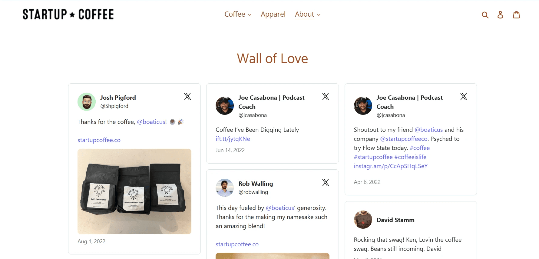
Startup Coffee’s wall of love showcases real customer praise pulled directly from X, keeping testimonials dynamic and authentic. This real-time social proof builds credibility, reinforces brand trust, and helps potential customers see genuine experiences, making them more confident in choosing the brand.
21. Superhuman
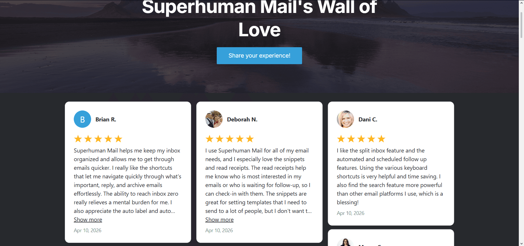
Superhuman’s wall of love takes a broader approach by aggregating praise from X, LinkedIn, and other platforms into one curated feed. Instead of relying on a single source, it blends professional and social conversations to show how the product is valued across different contexts, from casual users to power professionals.
22. Bloom Institute of Technology

Bloom Institute of Technology’s outcomes and testimonials wall of love strengthens brand credibility by grounding its claims in real graduate success stories and measurable results. By showcasing alumni outcomes alongside authentic student feedback, it turns abstract promises into tangible proof. This helps build trust, reinforce career impact, and improve confidence in enrollment decisions.
23. Chilipad
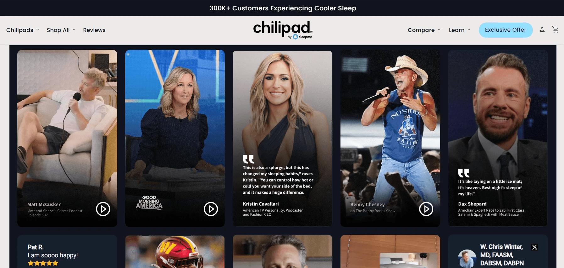
The wall of love on the Chilipad site targets higher conversion rates by reducing purchase hesitation for its premium sleep system. It builds trust through real customer experiences showing improved sleep and temperature control. This social proof reassures skeptical buyers, shortens the decision-making process, and strengthens confidence in the product’s effectiveness and value.
24. Beehiiv
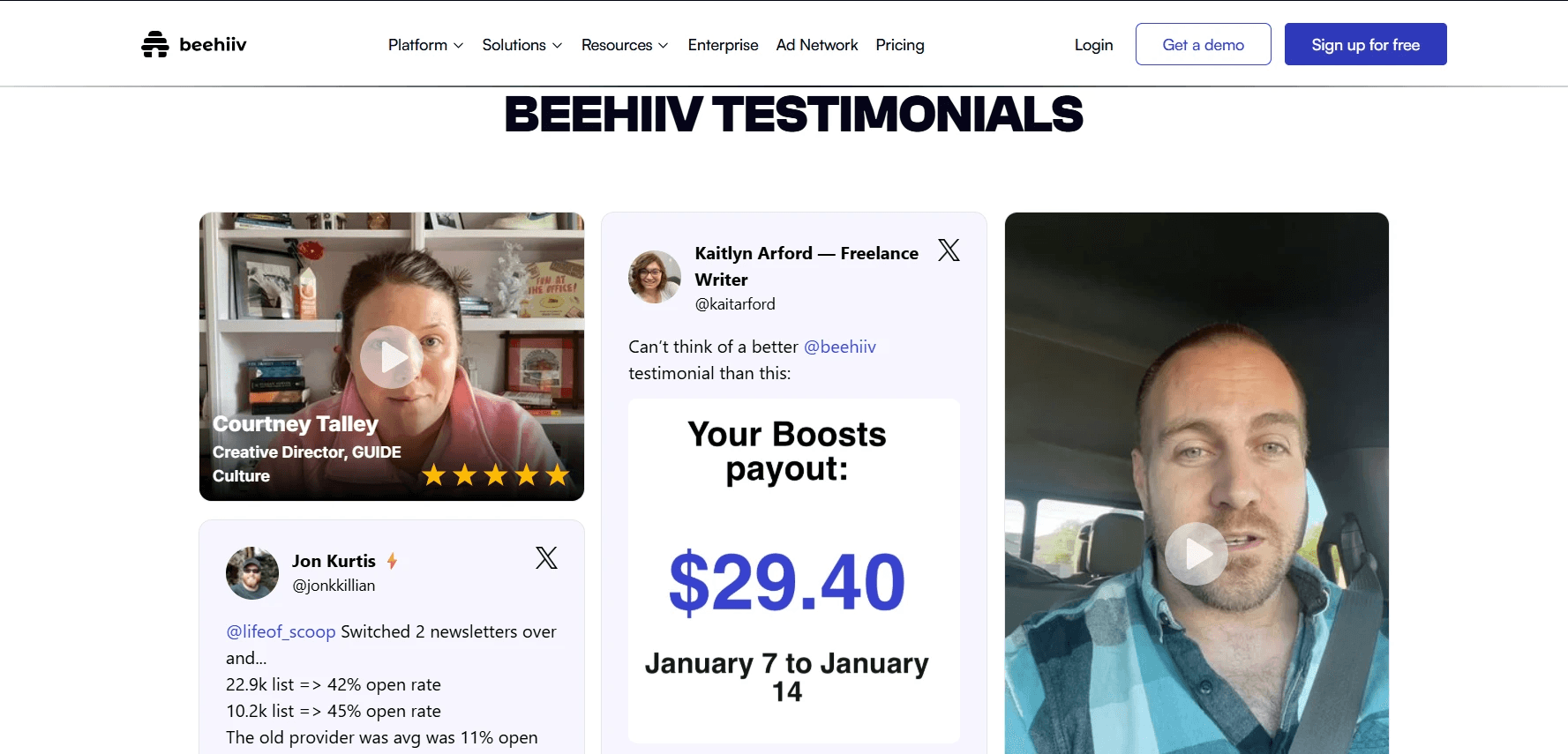
Beehiiv’s Wall of Love aims to win over visitors by showcasing authentic praise from creators and users across multiple platforms. This steady stream of social proof is more convincing than traditional marketing messages because it reflects real experiences, builds credibility, and reduces doubt during the decision-making process.
How to add a wall of love to your website
Now that you’ve got your creative juices flowing, here's how to set up your own wall of love.
Step 1. Select a free content aggregator
The first step in creating your own wall of love is to sign up for a content aggregator. The aggregator is how you will pull all those positive testimonials from social media. You’ll want to be able to moderate the content that shows up, so make sure you select an aggregator that allows you to moderate the content both manually and automatically.
With Curator you can aggregate up to three sources of content for free—which is more than enough to get your wall love up and running. And, since our aggregator integrates with all the major social platforms, including X (formerly Twitter), TikTok, Instagram, YouTube, Slack, Facebook, LinkedIn, and more, you’ll be able to pull the right content to fill your wall.
If you are wanting to add more than three sources don’t stress. Our incredibly affordable plans are always available and upgrading your account is super easy.
Step 2. Pull content
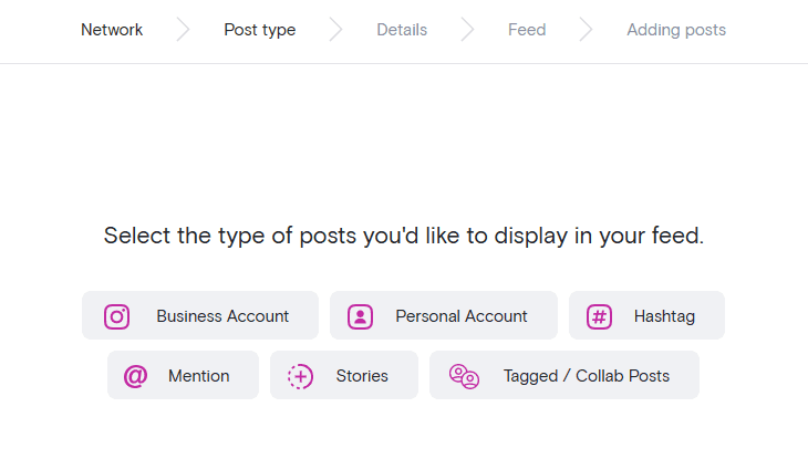
Once your account is set up, the next step is to pull content. This process is dependent on the aggregator you choose. Going with Curator keeps this process as simple as possible. You click “Create new feed”, name it, and decide the moderation style (“Approved” or “Needs approval”). From here you just follow the prompts to get your content and aggregator connected.
Since you are creating a wall of love, we recommend that you choose the “Needs approval” moderation style. This will require you to review and approve new content before it appears on your wall. That way you can vet the testimonials and ensure your wall's message stays on track.
Also, there are several types of content you can pull beyond your own accounts—such as hashtags and mentions. While it is ultimately dependent on what the social platform allows, this can accelerate your collection of positive feedback for your brand.
For example, pulling content from Instagram can be done by hashtags or mentions. And, you can create feeds that pull from multiple sources so your wall of love is not platform dependent.
Step 3. Choose the style of your wall
The next step is to choose the style of your wall. To do this click on “Style/publish feed.” You’ll have the option to completely customize your feed through the incorporated editing features, or by using your own custom CSS. Or, you can simply use one of our templates (that’s the option we recommend, but it’s totally up to you).
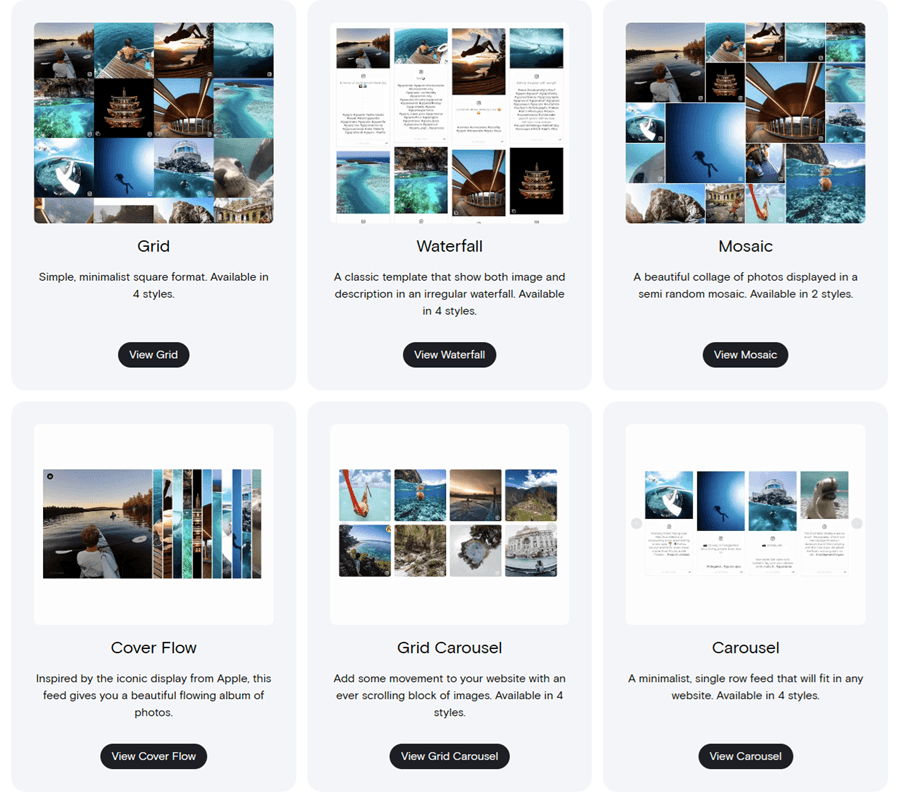
We recommend the “Grid”, or “Mosaic” format for wall of love photos. For wall of love testimonials, the “Waterfall” template is a great choice. Of course, the decision is yours so find the style that best fits your brand.
Also note that the templates are customizable as well so you can really get the look you are going for without having to start from scratch.
Step 4. Integrate your wall of love onto your website
The process of integrating your wall of love into your website is a simple copy paste procedure. Once you are finished styling your feed (Step 3 above), click on “Get code.” This will bring up the HTML code you’ll need to embed.
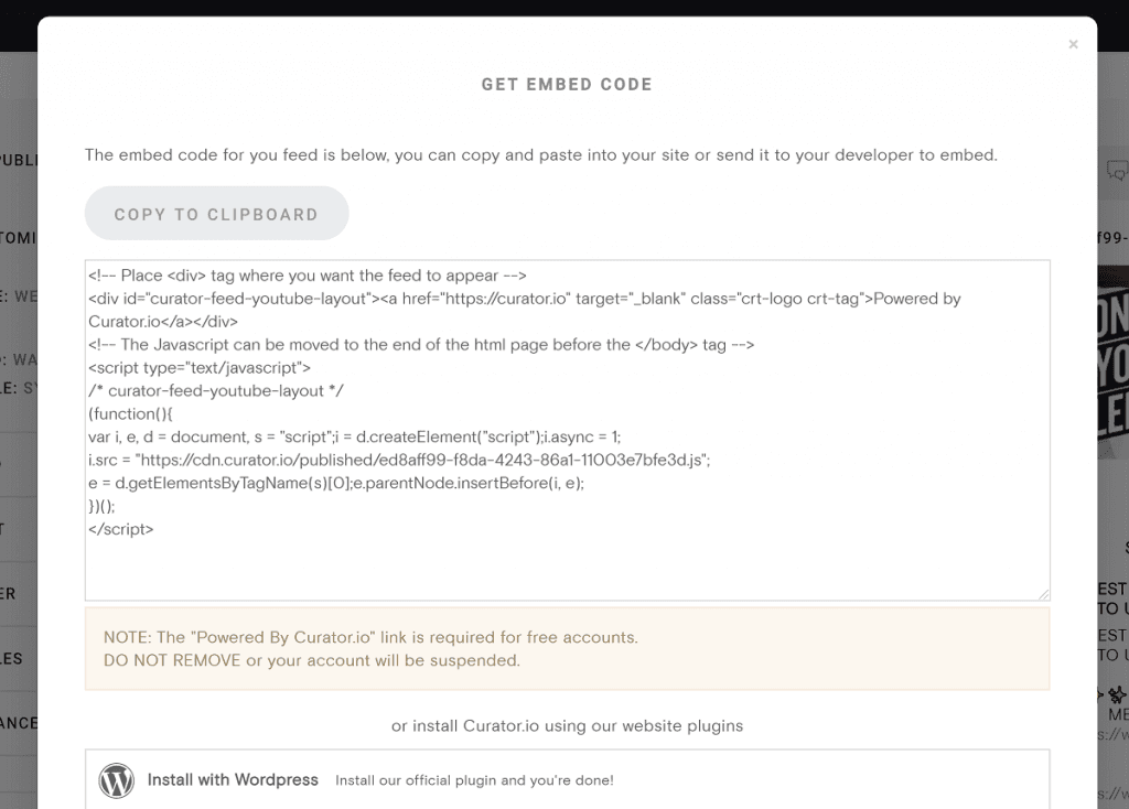
Copy the code to your clipboard, head over to your website, and embed the code where you want your wall of love to appear. If you are using Wordpress, you can also use our official Wordpress plugin as well.
Step 5. Moderate content
Congratulations! Your wall of love is up and running.
Remember that you’ll need to moderate your content. We recommend adding a regular scheduled time in your weekly calendar to log into Curator and go through the new posts. That way your wall of love can stay up to date.
What makes content wall-of-love-worthy?
Not all testimonials are equal. The most effective wall of love content have these features:
1. Specificity of praise
Wall-of-love-worthy content goes beyond generic compliments. Instead of vague statements like “great product,” the strongest testimonials explain exactly what stood out. Specific details about features, experiences, or use cases make the praise more believable and useful for potential customers.
2. Mention of results or outcomes
Content becomes far more powerful when it highlights measurable or meaningful outcomes. Whether it’s saving time, increasing revenue, improving workflow, or solving a clear problem, results show real impact. This shifts the testimonial from opinion to proof.
3. Named customer attribution
Credibility increases when feedback comes from a real, identifiable person or company. A named customer adds accountability and trust, making the endorsement feel authentic rather than anonymous or staged. It also helps readers relate to similar users.
4. Recency of feedback
Fresh testimonials carry more weight because they reflect the current state of the product or service. Recent feedback reassures visitors that the experience is up to date, relevant, and consistent with what they can expect today.
5. Emotional authenticity
Beyond structure, the best wall-of-love content carries genuine emotion. Whether it’s excitement, relief, or satisfaction, authentic tone helps humanize the brand and makes the praise more memorable and persuasive.
Frequently asked questions
What's the difference between a wall of love and a standard testimonial page?
A wall of love is dynamic, often pulling real-time social proof from multiple platforms, while a standard testimonial page is static, curated, and manually updated with selected customer quotes.
How do I collect content for a wall of love?
Collect content for a wall of love by gathering reviews from platforms like Google, G2, and Trustpilot, social posts from X and LinkedIn, customer emails, chat or Slack feedback, and video testimonials. With tools like Curator, you can automatically pull, organize, and display this content in one dynamic, always-updated feed.
Which platforms can I pull wall of love content from?
You can pull wall of love content from review platforms like Google, G2, and Trustpilot, social media platforms like X and LinkedIn, customer communication channels like email and Slack, and video platforms such as YouTube or recorded testimonials. These sources provide authentic, multi-channel social proof.
How many testimonials should a wall of love include?
There’s no fixed number, but a strong wall of love typically includes 20 to 100+ testimonials. The key is variety and freshness, not volume alone. Enough content should be shown to demonstrate consistent satisfaction without overwhelming visitors or diluting the most impactful messages.
Previous post: