In a world where customer trust is paramount, few things are more powerful than authentic reviews and testimonials.
So you’ve got the reviews, great!
But are you showcasing them as a banner of awesomeness for everyone to see?
If so, good for you. If not, well, say hello to the wall of love.
A wall of love made from reviews is more than just a review widget. It’s a hand-picked collection of your best customer feedback, curated to highlight the most persuasive, trust-building stories instead of reducing everything to an average star rating. That shift from raw ratings to intentional curation is what makes it so effective.
In this article, we’ll look at what sets a reviews-based wall of love apart from a generic star-rating widget and how to build one that actually converts.
Why add a wall of love to your website?
A wall of love is more than just a collection of glowing testimonials—it’s a powerful marketing tool that can directly impact how visitors perceive your brand. Whether you're an eCommerce store, a service provider, or a SaaS company, showcasing real customer feedback builds trust, boosts engagement, and enhances credibility.
If you're still not convinced, here’s a breakdown of some key reasons why adding a wall of love is a good idea.
Build trust through social proof
In today’s digital world, customers rely heavily on social proof when making purchasing decisions. With 79% of consumers placing reviews alongside personal recommendations their impact cannot be understated.
Increase conversions and sales
Trust directly influences buying behavior. By showcasing customer success stories, positive reviews, and product endorsements, you’re giving visitors a compelling reason to take the next step.
Enhance your brand’s credibility
Displaying a testimonial wall of love with reviews from real users, especially those tied to recognizable companies or influencers, can significantly elevate your brand’s credibility.
Visitors are more likely to trust a product or service when they see others—especially those they admire or relate to—endorsing it.
Foster community engagement
A wall of love isn’t just about showcasing positive reviews; it’s about celebrating your community. Featuring user-generated content, success stories, and customer shoutouts creates a sense of belonging.
Keep your website dynamic and engaging
Adding a wall of love brings fresh, ever-changing content to your website. This ensures your website remains active and engaging without the need for constant manual updates.
Showcase diverse customer experiences
A well-crafted wall of love allows you to highlight the different ways customers benefit from your product or service. Through featuring a mix of industries, customer profiles, and use cases, you can appeal to a broader audience.
Which platforms to pull from for your wall of love reviews
Choosing the right review sources depends on your industry, audience, and where your strongest customer feedback naturally appears. The best options include:
Google Reviews
Google Reviews are best for local and service-based businesses like salons, clinics, restaurants, and agencies. It captures real-world, location-based experiences, making it especially useful for everyday services where trust is built through in-person interactions. It’s also highly visible in search results, which adds extra credibility.
G2 and Capterra
G2 and Capterra are best for SaaS and B2B software companies. They are ideal for structured, feature-rich reviews from users who evaluate tools based on performance, usability, and business outcomes. These platforms help highlight product strengths in a more technical and decision-focused way.
Trustpilot
Trustpilot works best for ecommerce and online-first brands. It captures broad customer sentiment across the full buying journey, including product quality, delivery, and support experience. This makes it useful for showcasing overall brand trust at scale.
Yelp
Yelp is best for hospitality and local experience-driven businesses. It is commonly used by restaurants, hotels, and service providers where customer experience and word-of-mouth reputation heavily influence purchasing decisions.
How to select the best reviews for your wall of love
Choosing the right wall of love reviews is less about quantity and more about impact.
The goal is to surface feedback that builds trust, answers doubts, and shows real outcomes, like these ones:
1. Reviews that mention a specific outcome or result
Prioritize wall of love reviews that highlight clear results, such as time saved, revenue gained, or problems solved. Specific outcomes make the feedback more believable and persuasive.
2. Reviews with enough detail to be credible
Strong reviews go beyond one-liners. Look for wall of love reviews that explain the customer experience, what was used, and why it worked, as detail adds authenticity.
3. Reviews from named customers rather than anonymized
Whenever possible, choose reviews that include real names, roles, or company details. Identifiable wall of love reviews feel more trustworthy and reduce skepticism.
4. Reviews that address a common objection
Select reviews that directly respond to doubts like pricing, ease of use, or setup time. These help remove friction in the decision-making process and reassure hesitant buyers.
3 awesome examples of walls of love made with reviews
Here are three great examples for a little inspiration.
Example 1: Relume’s Community Love Page

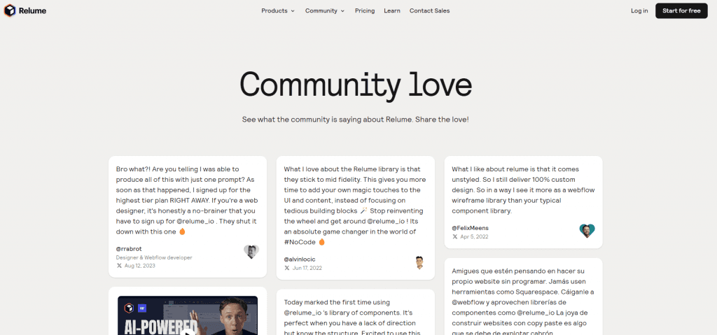
Relume’s community love page showcases heartfelt testimonials from its passionate community of designers and developers. The page is elegantly designed with a waterfall layout that allows each testimonial to flow naturally and create a visually engaging experience. By aggregating content from platforms like X (formerly Twitter) and YouTube, Relume effectively pulls in real-world feedback that shows how users are leveraging its platform to build websites faster and more efficiently.
Key features:
Elegant waterfall design: This layout creates a smooth, continuous flow, making the page dynamic and easy to read.
Community-driven content: Relume highlights how its users benefit from the platform.
Diverse success stories: The testimonials feature both written reviews and video shoutouts, providing a varied and engaging display of user experiences.
Cross-platform integration: Relume pulls content from multiple platforms like X and YouTube to provide a more comprehensive view of user feedback.
User engagement with shareability: The testimonials are designed to be easily shared, enabling visitors to further amplify the positive sentiment about the brand across social media.
Types of reviews this style is good for:
Longer-form testimonials.
User-generated videos
Multiple platforms
Community-driven content
By combining engaging design with diverse user experiences, Relume’s reviews wall of love successfully builds community and trust, while highlighting the platform’s real-world impact.
Example 2: Shopify's success stories

Shopify’s success stories page features detailed case studies from thriving businesses that have used their platform to scale and grow. These success stories often include both written and video content, providing a rich, multimedia experience. Each case study dives into how Shopify has supported businesses in achieving milestones which makes the page a powerful tool for building credibility and trust.
Key features:
Comprehensive case studies: Shopify goes beyond short testimonials by offering in-depth narratives about how different businesses succeeded using their platform.
Multimedia integration: The page includes both video and written content, engaging visitors who prefer different types of media.
Emphasis on business growth: The testimonials highlight metrics such as revenue increases, market reach, and operational improvements. This amplifies the message of how Shopify drives business success.
Industry-specific examples: Shopify segments the success stories by industry, allowing potential users to see how the platform benefits businesses similar to theirs.
Search and filter functionality: Visitors can easily find relevant case studies by using filters based on business type, size, or goal.
Customizable calls to action (CTAs): Each story includes a tailored CTA to encourage visitors to start their own Shopify journey.
Types of reviews this style is good for:
In-depth, data-driven stories
Video testimonials
Business-to-business case studies
Success stories across industries
By offering data-driven, multimedia-rich case studies, Shopify’s wall of love not only builds credibility but also inspires potential users by showcasing real-world business success stories tailored to various industries.
Example 3: Zapier's testimonial quotes

Keeping it simple and concise, Zapier’s testimonial quotes focuses on short, impactful quotes from users. The page uses a minimalist, continuously scrolling format that allows visitors to continually see new feedback. Each quote is paired with the user's name and handle which adds credibility and a personal touch to the reviews.
Key features:
Minimalist design: The page avoids clutter, allowing the testimonials to stand out without distractions.
Scrolling carousel: The continuous scroll keeps visitors engaged and exposed to an ever-updating stream of positive feedback.
User details for credibility: Each testimonial includes the user’s name and handle, adding a layer of authenticity to the quotes.
Focus on key benefits: Testimonials are carefully curated to highlight specific product benefits.
Fast-loading: The page’s simplicity ensures it loads quickly to maintain a smooth and seamless user experience.
Types of reviews this style is good for:
Short, impactful quotes
Rapid user feedback
Credibility-focused testimonials
Feature-specific feedback
Snapshot reviews
By focusing on short, powerful quotes with continuous scrolling, Zapier’s wall of love keeps the user experience engaging and authentic, while quickly showcasing the most important product benefits.
How to create your own wall of love with reviews
Creating your own wall of love testimonials is a straightforward process. Here are the four steps to get yours up and running.
Step 1. Choose a content aggregator
The first step in building your wall of love is choosing a content aggregator. An aggregator allows you to pull testimonials, reviews, and shoutouts from various platforms like social media or review sites, and showcase them on your website. Look for a tool that offers both manual and automated moderation so you have full control of what is benign displayed.
With Curator, you can pull content from platforms such as X (formerly Twitter), Instagram, TikTok, YouTube, Slack, Facebook, LinkedIn, and more. Even on the free plan, you can aggregate content from up to three sources—plenty to get your wall of love started.
If you need more sources, our incredibly affordable plans are always available and upgrading is super easy.
Step 2. Pull the reviews
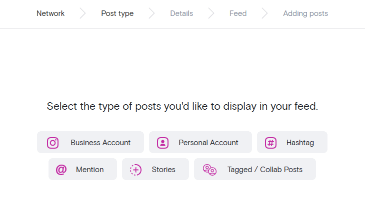
After setting up your aggregator account, the next step is to add reviews to your wall of love by pulling in content. This involves clicking "Create new feed," naming it, and deciding the moderation style ("Approved" or "Needs approval"). Choosing "Needs approval" gives you full control over what reviews are displayed on your wall of love by requiring manual approval of each post, ensuring everything is on-message.
You can pull content directly from your social media accounts or use hashtags and mentions to capture user-generated content. For example, you might pull Instagram posts that include a specific branded hashtag.

Curator makes it simple to create feeds from multiple sources, allowing you to gather glowing reviews from across platforms.
Step 3. Select the style of your wall of love
Next, it’s time to style your Wall of Love. Most aggregators offer pre-designed templates or the option to fully customize the feed’s appearance. We recommend a Grid, Mosaic, or Waterfall format for your wall of love, but the choice is totally up to you and your brand's style. Each option has its advantages:
Grid or Mosaic are perfect for photo-heavy reviews.
Waterfall is great for showcasing longer testimonials.

Don’t worry if you aren’t sure which style works best—these templates are flexible, and you can tweak them to match your brand’s look and feel, either by adjusting design elements within the tool or using custom CSS.
Step 4. Integrate your wall onto your website
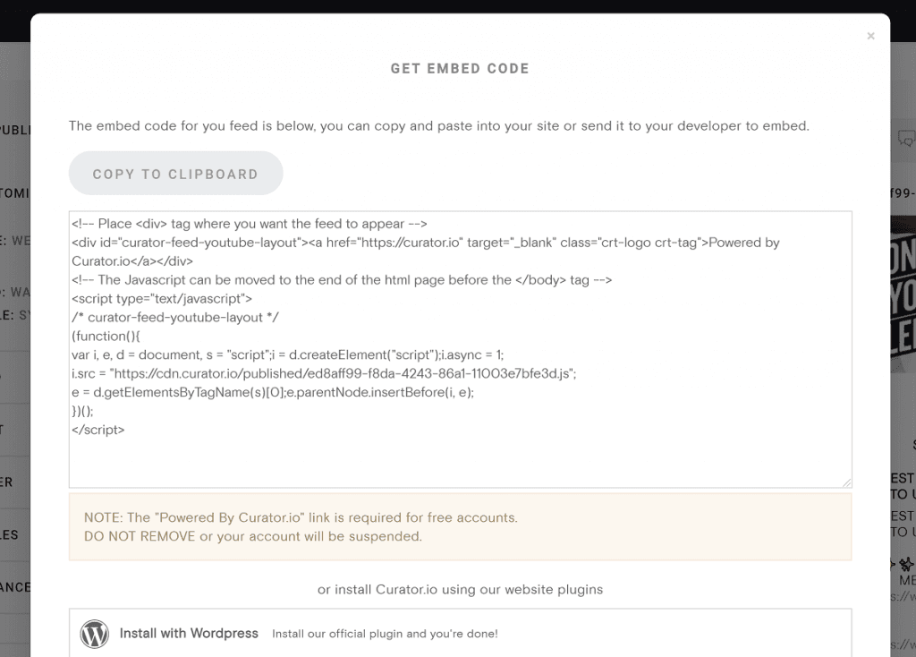
Integrating your wall of love into your website is as simple as copying and pasting the embed code. Once you’ve finished styling your feed, click “Get code,” copy it, and paste it into your website’s HTML where you’d like the wall to appear.

For WordPress users you can use our official plugin as well to make embedding the feed even easier.
Step 5. Moderate the reviews to be displayed
Now that your wall of reviews is live, don’t forget the most important part: moderation! Regularly review new content, approving reviews that align with your brand. This keeps your wall of love fresh and ensures it continues to reflect your business in the best possible light.
We recommend scheduling a weekly check-in for moderation, unless you are hosting an event. Then you’ll want to be on par with the event itself.
Frequently asked questions
What's the difference between a reviews widget and a wall of love?
A reviews widget shows an automated feed or average ratings from platforms. A wall of love is a curated selection of the best reviews, chosen to highlight strong, trust-building customer stories rather than just displaying all feedback.
Should I show all reviews or only curated ones?
A wall of love works best when it is curated. Instead of showing every review, focus on selecting your strongest wall of love reviews that highlight clear outcomes, detailed experiences, and trust-building stories, while filtering out low-value or repetitive feedback.
How many reviews should a wall of love include?
There is no fixed number, but a strong wall of love usually features 10 to 30 carefully selected reviews. The focus should be on quality and relevance, not volume, so every review reinforces trust and supports conversion.
Can I pull from multiple review platforms at once?
Yes. A wall of love can combine reviews from multiple sources like Google Reviews, Trustpilot, G2, and Capterra. Tools like Curator make this easy by aggregating wall of love reviews from different platforms into one curated feed, helping you build a more complete and credible display of customer feedback.
Ready to create your own wall of love? Try our free forever feed.
Previous post: