7 Tips for Choosing a Perfect Color Scheme for Your Website (+Examples)
Dayana Mayfield
on
Nov 7, 2024
You’re probably staring at a blank canvas, wondering how to make your website pop. Choosing the right color scheme can feel like a puzzle, but it’s a vital piece of your digital marketing strategy.
There’s a lot of skill and actual science that goes into choosing colors for web design applications. Colors can influence emotions, guide user behavior, and even boost conversions. For instance, big fast-food chains like McDonald’s and Burger King use red and yellow in their branding because these colors can stimulate appetite.
In this article, we’ll guide you through seven practical tips to nail your website’s color palette. We’ll equip you with the know-how to pick colors that look great and support your marketing goals at the same time.
Let’s give your website a color makeover.
1. Keep Things Simple
When it comes to color schemes, less is often more. Sticking to just one or two main colors might seem limiting, but it’s a powerful strategy that can make your website stand out.
Simplicity is memorable and easy on the eyes. A minimal color palette helps your content shine without overwhelming visitors. It creates a clean, professional look that’s both modern and timeless.
It’s also easier to maintain consistency across your site when you’re working with fewer colors. This consistency builds brand recognition and trust – key factors in digital marketing success.
Here’s how to work with up to two colors:
Choose one primary color that represents your brand’s personality. This could be based on your logo or industry trends.
Pick a neutral color like white, black, or gray as your secondary color.
Use your primary color for important elements like CTA buttons or headings, and let your neutral color dominate the background and text.
Add depth by using different shades of your chosen colors. For example, if your primary color is blue, use lighter and darker blues for various elements. This adds visual interest without complicating your palette.
A brand that nails this strategy is Pinch, a Chicago concierge med spa service. They’ve stuck to a black-and-white scheme throughout their site. It’s clean, crisp, and exudes professionalism – perfect for a brand in the health and beauty sector.
The stark contrast between black and white makes their content pop. Important information stands out, and the overall effect is sleek and modern. It proves you don’t need a rainbow to make an impact.
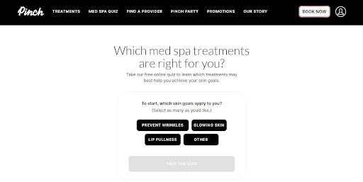
Pinch’s approach shows that sometimes, the boldest statement is the simplest one.
2. Prioritize Primary Colors
Red, blue, and yellow – the building blocks of the color world. These primary colors pack a punch in web design, and for good reason. They’re bold, eye-catching, and universally recognizable. But their power goes beyond just looking good.
Primary colors tap into our basic instincts and emotions. Red energizes and creates urgency, perfect for CTA buttons. Blue instills trust and calm, ideal for finance or healthcare sites. Yellow brings optimism and clarity, which is great for highlighting key information.
Here’s how to use primary colors in your design:
Choose one primary color as your dominant hue. Use it for your main brand elements like logos or headers.
Use the other two sparingly for accents or to draw attention to specific areas.
Too many of these vibrant colors can be overwhelming. Try pairing them with neutral tones like white or gray to give your visitors’ eyes a break.
Play with shades and tints. A deep navy or a pale yellow can still carry the psychological impact of their primary counterparts.
Classical Guitar Shed, an online guitar learning platform, uses the primary color trifecta in their web design.
Blue dominates their site, creating a calm, focused learning environment. Red highlights important course information, while yellow draws attention to key CTAs.

This clever use of primary colors does more than just look good. It guides the user’s journey through the site, making learning guitar feel organized and achievable. The blue builds trust in their teaching methods, the red sparks curiosity about courses, and the yellow motivates action to sign up.
This approach shows how these fundamental colors can create a user experience that’s both engaging and intuitive.
3. Consider Your Target Audience
Your color scheme needs to make your site look beautiful while resonating with the right audience.
This strategy is essential because color influences buying decisions more than you might think. In fact, nearly 85% of consumers say color is the main reason they buy a product.
Understanding your target audience helps you pick colors that speak their language. Different demographics respond to colors in various ways. For instance, younger audiences might gravitate towards bold, vibrant colors, while older generations often prefer more subdued tones.
Here’s how to match your color scheme to your target audience:
Start by creating customer personas. Who are they? What are their preferences? What emotions do you want to evoke in them?
Once you have these insights, research color psychology. Blues and greens often work well for health brands, while reds and oranges can be great for food-related businesses.
Colors can have different meanings across cultures. What’s positive in one country might be negative in another. If you’re targeting a global audience, make sure your color choices translate well across borders.
Use A/B testing to see which colors drive more engagement or conversions. Data doesn’t lie, so let your audience’s behavior guide your final decision.
Now, let’s look at CapitalPad, a platform connecting investors with investment deals. They’ve aced the art of color-audience alignment.
Given their niche in the finance sector, they’ve opted for a monochrome color scheme. Think dark gray, white, and subtle shades in between.

This choice isn’t random. It screams sophistication and seriousness – exactly what you’d want from a financial platform. The monochrome palette reflects the no-nonsense attitude of their target audience: seasoned investors looking for solid opportunities.
4. Integrate Your Branding
Your brand colors aren’t just for decoration. 80% of consumers believe colors help boost brand recognition, making them a powerful tool for having a memorable business.
Integrating your brand colors into your website creates a seamless experience for visitors. It reinforces your brand identity, builds trust, and helps you stand out in a crowded digital landscape. Plus, it makes your site feel professional and put-together – always a good look for any business.
With tools like Tailor Brands, you can design a business logo that captures your brand’s personality, helping you establish a memorable presence online.
Here’s how to harmonize your colors and your branding:
Start with your logo colors. These should be the foundation of your website’s color scheme.
Use your primary brand color for important elements like headers or CTA buttons. Secondary brand colors can work great for accents or backgrounds.
Extend your brand colors to your images, icons, and even your typography.
Remember that balance is key. You don’t want to overwhelm visitors with a color explosion. Use neutral colors to give the eye a rest and make your brand colors pop.
University of Delaware’s recognizable blue and yellow colors aren’t just for sports jerseys – they’re front and center on their website.
By using these colors consistently across their site, they’ve created a cohesive online experience. Whether you’re a prospective student, an alum, or just browsing, there’s no mistaking whose site you’re on.

On the flip side, Investing.io, a community platform for investing, startup, and small business deal discussions such as M&A fees by deal size, applies an approach that’s a bit different, but equally effective.
With a logo featuring black, green, yellow, and pink, they’ve embraced diversity in their color scheme. Their website is a vibrant palette, with different sections sporting various colors.

This colorful approach isn’t random – it’s a clever reflection of their brand ethos.
As a platform welcoming diverse ideas and people, their multi-hued design represents openness and acceptance. It’s a visual cue that says, “All ideas are welcome here,” which is spot-on for a community-driven investment discussion platform.
5. Reflect on Your Product
Your product is the star of the show, so why not let it shine through your color scheme? This strategy can help you create an instant visual connection between your website and what you’re selling.
When your color scheme reflects your product, you’re essentially creating an experience. You’re helping customers visualize your product in action and build anticipation. You’re also making your site more memorable. When customers see those colors elsewhere, they’ll think of your brand.
Here’s how to connect your color scheme to your product:
Outline your product’s key features and benefits. What colors represent these? If you’re selling eco-friendly products, greens might be your go-to. For luxury items, think gold or deep purples.
Think about the emotions your product evokes as well. Soft blues and lavenders might work well if you’re selling relaxation products. Fitness gear? Energetic greens and oranges could be the ticket.
Remember, subtlety can be powerful. You don’t need to plaster your site with product colors. Use them strategically for accents or important elements to create a cohesive look without overwhelming visitors.
Infraredi, a company selling red light therapy machines, hits the bullseye with their color strategy. Their primary color is a warm, inviting red that perfectly mirrors the distinctive glow their devices emit.
This clever color choice does double duty. It instantly communicates what Infraredi sells while also evoking the warm, comforting feeling of their therapy lights. Visitors get a taste of the product experience just by browsing the site.

This likeness to their product in their color scheme allows Infraredi to create a website that’s a preview of the benefits their devices offer. It’s a smart move that sets them apart in the health and wellness market.
6. Use a Spectrum of a Single Color
Sticking to one color doesn’t mean you’re limited. In fact, using a spectrum of a single hue can create a sleek, cohesive look that’s both eye-catching and professional. This strategy, also known as a monochromatic color scheme, is a powerhouse in web design.
It’s visually appealing without being overwhelming. It creates harmony and balance, guiding users smoothly through your site. It’s also foolproof – different shades of the same color always work together, so you can’t go wrong.
Here’s how to make the most out of a single color:
Pick your base color. This could be your brand’s primary color or one that represents your industry.
Play with different shades, tints, and tones of that color. Use lighter versions for backgrounds and darker ones for text or buttons to create contrast.
Use different intensities of your chosen color to highlight different elements. Gradients can add a modern touch, while solid blocks of color can draw attention to important areas.
When necessary, go bold with your base color. Even bright hues can work well in a monochromatic scheme when balanced with softer shades.
Remember to still use neutrals like white, black, or gray to break things up and add depth.
As a great example of opting for a monochromatic color scheme, we chose Rosie, an AI answering service for companies. They’ve embraced a spectrum of purple in their website design, a popular choice among modern SaaS companies.
They employ light, gradient tones for backgrounds, creating a soft, welcoming feel. For buttons and icons, they opt for darker, solid shades, ensuring these interactive elements stand out.

This is a masterclass in using a single-color spectrum to build a strong brand identity and guide users through your site.
7. Maintain Contrast
Contrast is all about being functional. A well-contrasted color scheme can make your website easier to read, navigate, and remember.
Contrast is vital because it helps guide your visitors’ eyes to important elements, improves readability, and makes your site accessible to more people. It can also add visual interest and depth to your design without complicating your color palette.
Here’s how to pull off contrast in your color scheme:
Pair light colors with dark ones. Think white text on a dark background or vice versa. Contrast can also come from pairing warm colors (like reds and oranges) with cool ones (like blues and greens).
Implement the 60-30-10 rule: use your dominant color for 60% of your design, a secondary color for 30%, and an accent color for the remaining 10%. This creates a balanced look while ensuring enough contrast.
For text, aim for a contrast ratio of at least 4.5:1 for normal text and 3:1 for large text. An online tool like Siteimprove can help you check this.
Ensure that your CTA buttons pop against your background color.
Let’s look at Eden Emerald Mortgages, a leading Australian mortgage broker firm, for some contrast inspiration. They’ve taken on a challenging color combo (forest green and coral orange) and made it work beautifully.
These colors could easily clash, but Eden Emerald’s smart use of white creates the perfect balance. They use white as a neutral backdrop, allowing the green and orange to shine without overwhelming the eye. This creates clear sections on the page and improves readability.
Learn more about Curator, the easy tool for adding your social media feed to your website.
Previous post: