You have a space on your homepage and a decision to make about what fills it. You already know you want a social media feed. What you need now is to see one working on a real page.
Every other gallery sorts examples by platform or by industry. That is not how you are thinking about this. You are thinking about what the feed has to do: sell a product, prove your work is real, keep people informed, or carry testimonials.
So that is how these fifteen are grouped.
I pulled these from a much longer list of sites running embedded feeds. The ones that made the cut all do one job clearly, and you can tell what that job is within a few seconds of landing on the page.
Every entry below covers the same three things. What the feed shows. The payoff it earns. And what has to be true of your site before you copy it.
What a social media feed actually does for a page
A social media feed on a website is a live section of your own page. It pulls posts from platforms like Instagram, TikTok, or Facebook, and it refreshes on its own.
Some of the examples below pull from a brand's own account. Others pull from customers, which is a meaningful difference in what the feed does for you. If you are weighing that choice, start with what a user generated content website is.
A feed earns its place by doing one job well. It keeps your page fresh, adds proof, and can improve ranking. None of that happens if the feed is there because the space looked empty.
15 social media feed examples, grouped by what the feed accomplishes
Skip ahead to the group that matches your situation. The examples inside each one are doing the same job in different industries, which is more useful than grouping them by industry and hoping the job transfers.
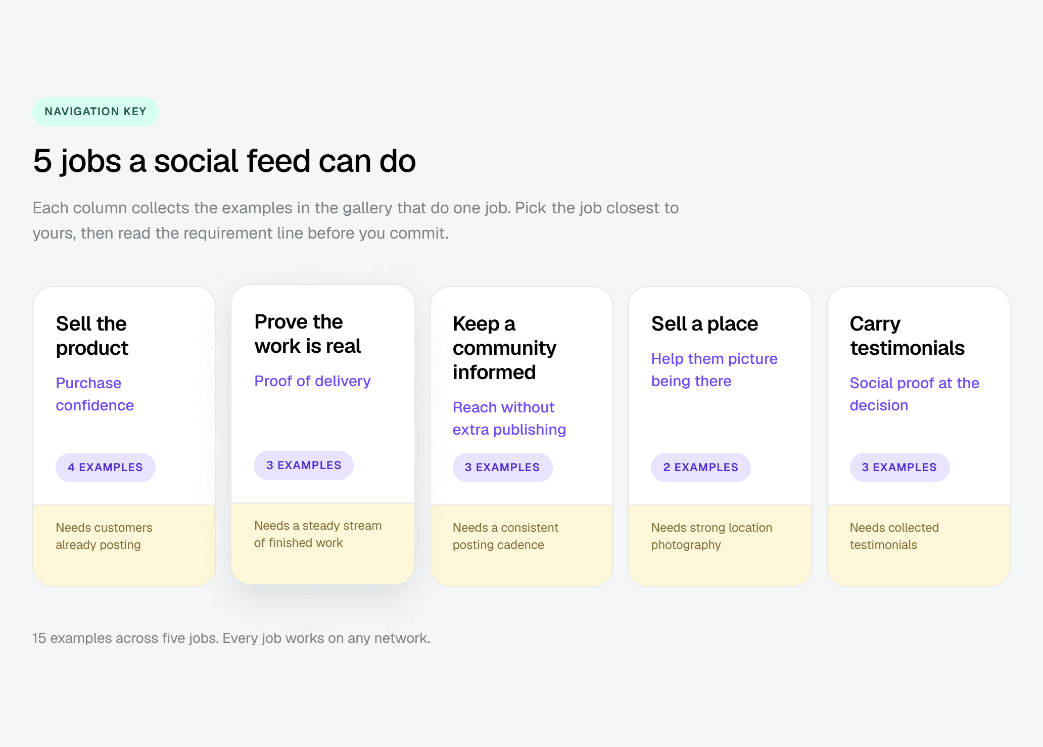
Feeds that sell the product
Four ecommerce sites, all using the feed to close the gap between a product photo and a real object someone owns.
1. Jungmaven

Hemp clothing is a values purchase before it is a wardrobe purchase. Jungmaven builds its feed around the lifestyle and culture attached to the brand rather than the garments themselves. A visitor gets the worldview alongside the product, which is what they are buying anyway. The payoff is a shopper who has bought into something before they price anything. This works if your brand genuinely has a culture to show. If your social output is product shots, the feed becomes a second catalog.
2. Evolution Power Tools
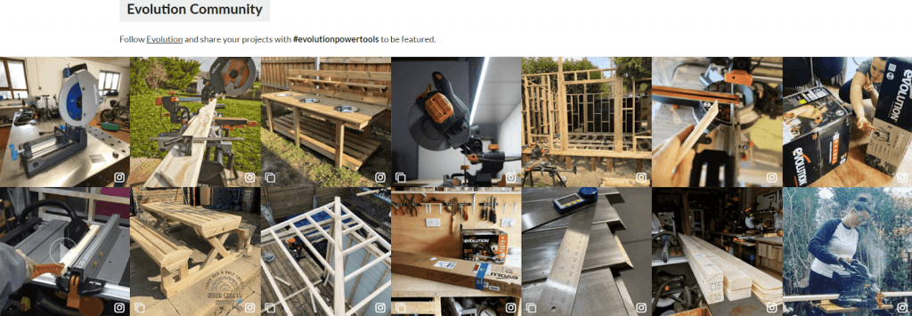
Power tools do not sell from a studio shot. Evolution Power Tools leans on customer footage and product presentations, so visitors watch the tools cutting through material in somebody else's workshop. The payoff is a buyer who has already seen the thing work before they read a single spec. Copy this if your customers film what they buy. If they do not, you will be filling the feed yourself, and that shows faster than you would think.
3. Dover Saddlery
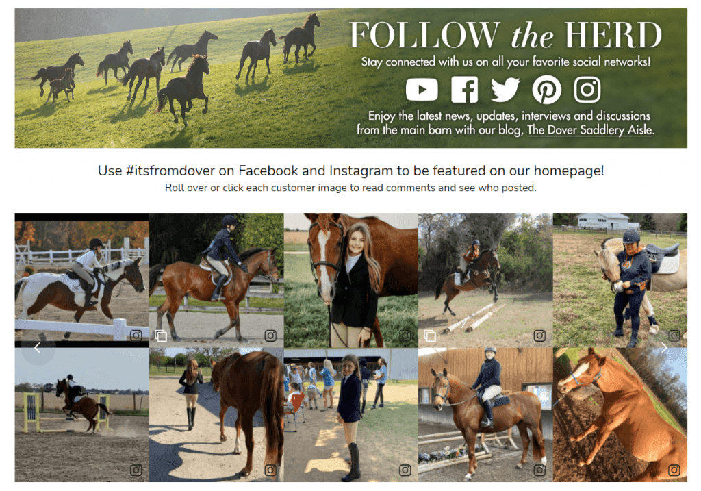
Dover Saddlery puts customer-submitted Facebook and Instagram images directly on its home page, and asks shoppers to post with branded hashtags to get featured. The feed doubles as a collection mechanism, and that is the part worth stealing. A shopper sees other riders using the tack, and the people who want to appear on the page go and post. It only works if you actually feature what comes in. A hashtag nobody sees rewarded stops getting used.
4. Adorn512
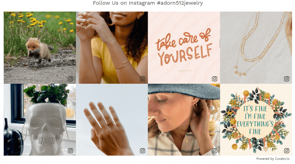
A clean grid does more work than it gets credit for. Adorn512 uses one to show handmade jewelry in context, worn rather than photographed on a stand, and surfaces coupons in the same space. Inspiration and an offer arrive together, so a browser who came to look has a reason to buy. The risk is obvious once you see it. Let promotional posts crowd out the styling content and the feed stops being worth scrolling.
If nobody is posting about you yet, this whole group is premature. Build the habit first. Collecting UGC on Instagram comes before embedding it.
Feeds that prove the work is real
For a considered purchase, your buyer is quietly asking whether you can actually do the thing. These three answer that before anyone gets in touch.
5. Sika
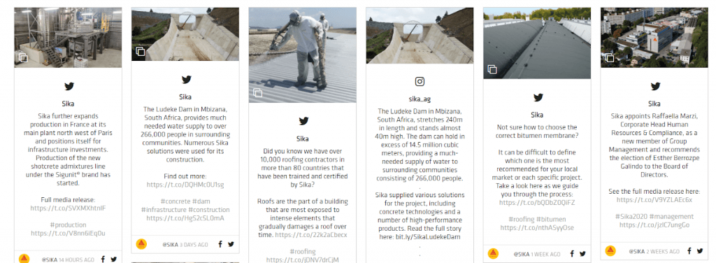
Sika pulls from Instagram, X, Facebook, LinkedIn, and YouTube to show where its products ended up, alongside news and product updates. For a company whose output disappears inside somebody else's building, the feed is the only place that work stays visible. A specifier sees real projects without navigating five channels. It needs genuine activity on each source, though. A five-platform feed running off two live accounts looks thinner than a single-platform one.
6. DBS Staircase
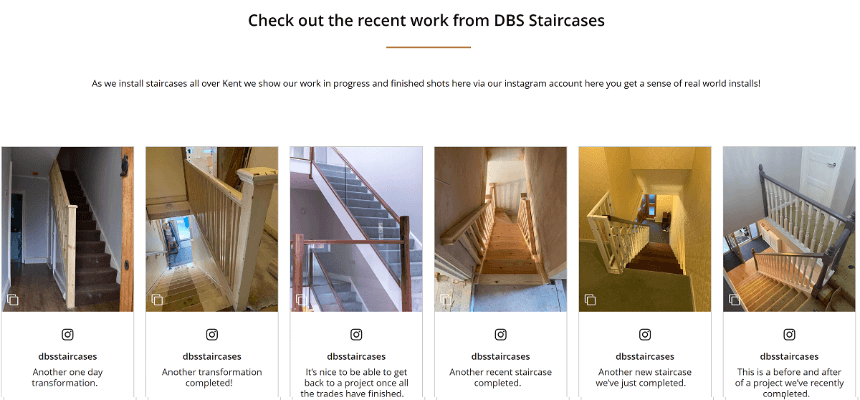
Completed work is the entire pitch for a trade business. DBS Staircase embeds Instagram posts of finished staircases, so a prospect browses actual installations instead of a services list. The payoff is a shorter path from interest to enquiry, because doubt about capability has already been handled. This transfers to anyone who photographs finished jobs as a matter of routine. If your photos live on a phone and never get posted, the feed stalls in week three.
7. Architectural Depot
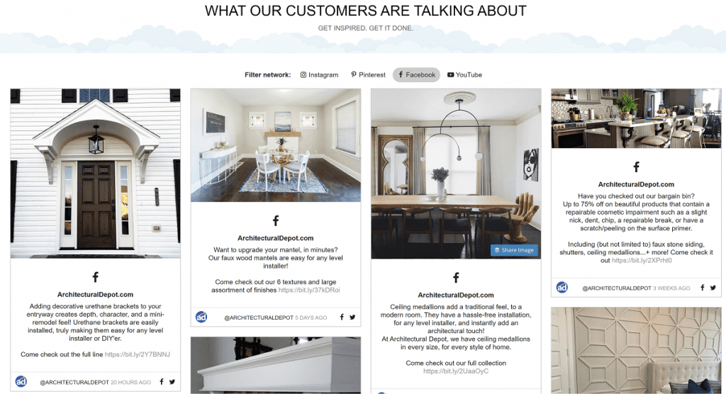
Not every feed is trying to sell on the page. Architectural Depot uses its feed to move visitors onto its social channels and widen the footprint. That is a legitimate goal, and it changes what good looks like. The measure here is follows, not clicks to product. Decide which one you actually want before you build. A feed designed for cross-channel discovery will look like a failure if you judge it on revenue.
Feeds that keep a community informed
The payoff across this group is reach without extra publishing work. The feed broadcasts to people who visit your site but never followed the accounts.
8. The City of Riverside
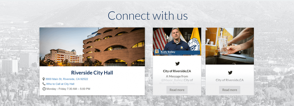
The City of Riverside embeds its posts in the website footer, under a "Connect with us" section sitting alongside location details. Residents get announcements from any page on the site without hunting for them. The reach matters more than it sounds: most people who need city updates will never follow a city government account. Footer placement is doing real work here too. The feed stays available without competing with whatever the visitor came for.
9. Sheridan College
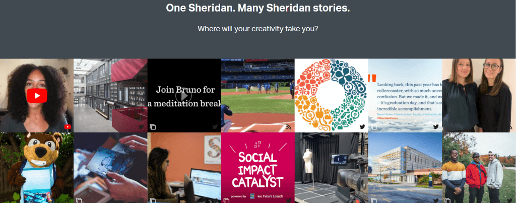
Prospective students are trying to picture a place they have never been. Sheridan College combines Twitter, YouTube, RSS, and Instagram into one view of campus life, mixing photos, student posts, and announcements. The payoff is a page that answers "what is it actually like there" without a brochure. It depends on students posting, not just the comms team. A feed pulling only from official accounts gives you a prospectus in a different font.
10. Be the Change HR
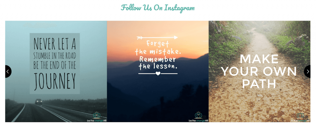
Be the Change HR runs Instagram content built around inspirational messages, matching how the business positions itself as support for small teams. The feed reinforces the promise instead of describing it, which is a subtle payoff: tone working as evidence. It only holds if the content is genuinely yours. Reposted quote graphics with no point of view read as filler. You will spot it yourself the moment you look at the page cold.
Posting cadence matters more in this group than anywhere else on the page. A quiet account shows up fastest inside a feed built to look current.
Feeds that sell a place
Two organizations using photographs from people who have already been there, which does a job no amount of destination copy manages.
11. Albany Visitors Center

Albany Visitors Center uses Instagram posts to build a picture of what there is to discover. Visitor photographs make a place look like somewhere real people actually go, and that is the difference between a destination page and a travel ad. The payoff is a visitor who can imagine the trip. It needs a steady supply of decent photography, which is why hashtag collection matters more here than in any other group.
12. Department of State Growth for Tasmania

Government programs are a hard sell on a web page. The Department of State Growth for Tasmania uses social posts to promote opportunities and economic development, putting projects and faces against what would otherwise be policy language. The payoff is a page that looks active rather than archival. Copy this if your organisation announces things regularly. If updates arrive quarterly, the feed will draw attention to the gaps rather than cover them.
Feeds that carry testimonials
Social proof placed where a decision happens. The three below take three different approaches to the same job.
13. Zapier
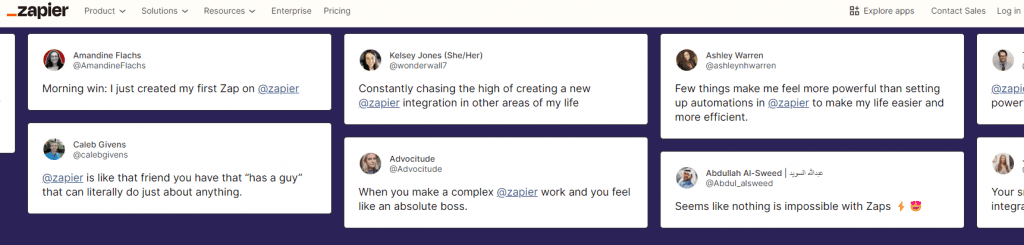
Restraint is the lesson from Zapier. Its testimonial quotes are short and sit lightly on the page, supporting the surrounding content instead of competing with it. The payoff is proof that does not interrupt. Testimonial sections usually fail the other way, taking a full screen to say what one sentence would have said. If you want the same effect, look at how a testimonial wall is structured before you build anything.
14. Relume
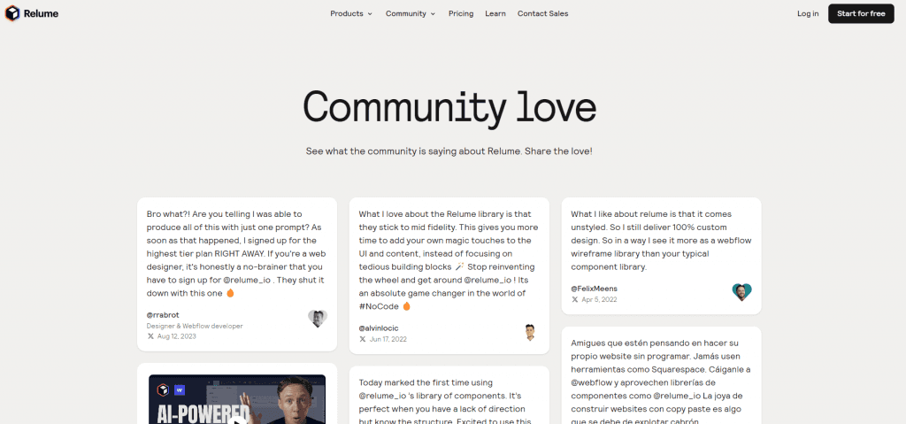
Relume goes the opposite direction with a dedicated community love page, filled with testimonials from the designers and developers who use it. That works because the volume justifies a destination. The payoff is one link you can send anyone who asks whether the product is any good. Do not build one of these on eight testimonials. Below a certain density, a wall of love page looks emptier than no page at all.
15. Marisa Shadrick

Marisa Shadrick repurposes her own Instagram content onto her site, carrying personality and tips rather than customer praise. For a personal brand the operator is the product, so the feed works as evidence in the same way a client testimonial does elsewhere. The payoff is familiarity before the first call. This is the only example here that needs no customer participation at all, which makes it the easiest to copy and the easiest to let go stale.
I look at where a feed sits on a page before I look at how it is styled. Placement usually tells you what the team wanted it to do.
Pick the placement before you pick the layout
Every gallery on this topic crops its screenshots to the feed and stops there. The page around the feed is doing half the work, and cropping it out is why so many teams copy a layout and get nothing back.
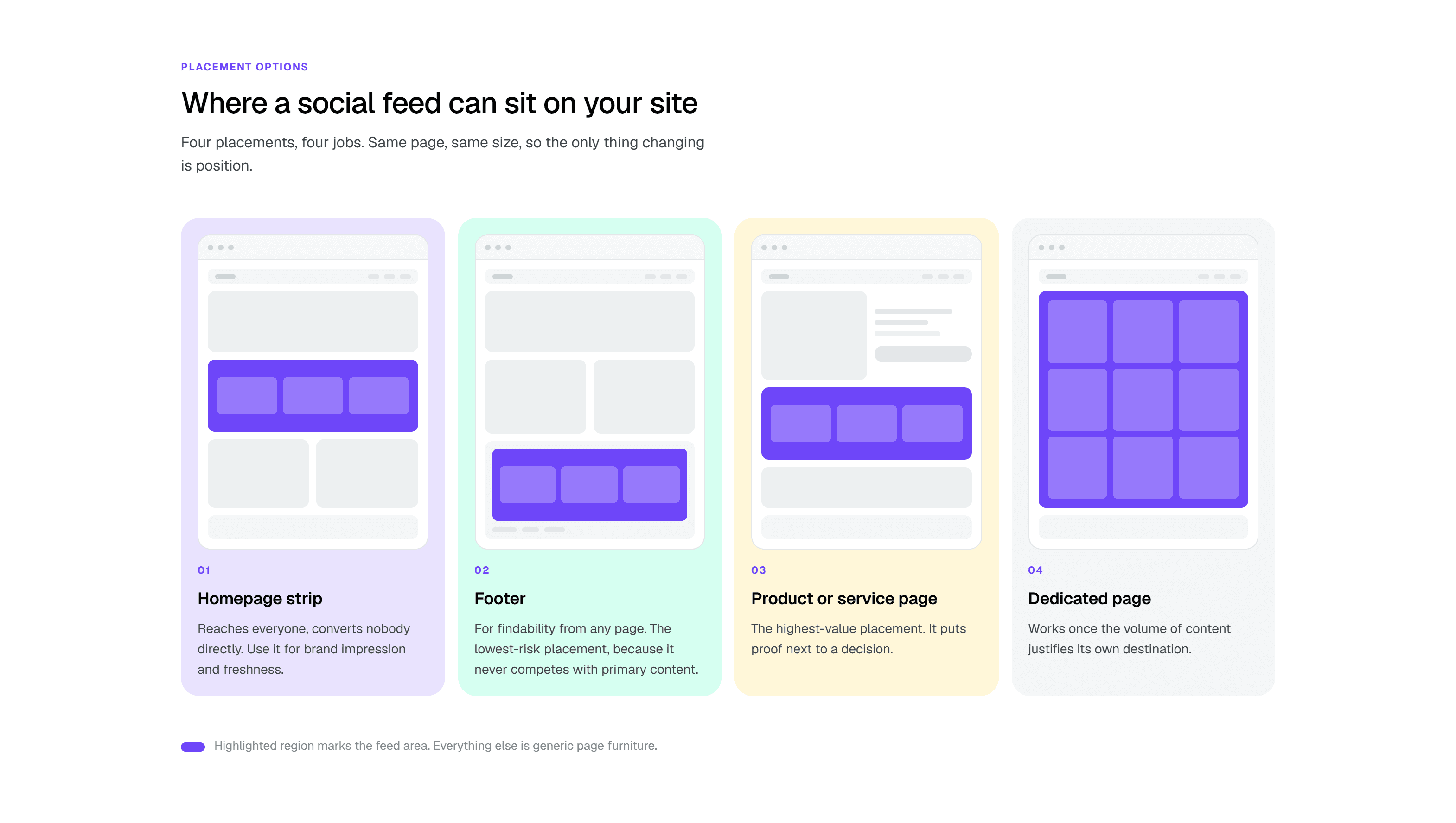
A homepage strip reaches everyone and converts almost nobody directly. That is not a failure, it is the job. Use it for brand impression and freshness, and judge it on whether the site feels current rather than on clicks. Jungmaven and Adorn512 both work this way.
A footer feed is the lowest-risk placement you have. It never competes with your primary content, and it stays reachable from every page on the site. The City of Riverside example is the clearest version of this. If you are nervous about a feed pulling attention away from something that converts, the footer is where you start.
A product or service page feed is the highest-value placement available to you, and the most underused. It puts proof directly next to a decision, at the exact moment someone is deciding. Filtering matters here. A general brand feed on a product page is noise, but a feed filtered to posts about that product is evidence.
A dedicated page works once the volume of content justifies its own destination. Relume's community love page is the model. This is also the placement that fails most visibly, because a page with nothing else on it has nowhere to hide a thin feed.
A small outdoor gear retailer ran a customer photo feed across the bottom of their homepage for about a year. It looked good and nobody clicked it. They moved the same feed onto three product pages, filtered to posts tagged with those products, and left the homepage strip alone. The product page feeds started earning engagement almost immediately, because the content was answering a question the visitor was already asking.
That points at the most common mistake, which is one feed embedded everywhere. The same content works as a homepage strip and reads as filler on a product page. Build a second feed before you build a second placement. It takes minutes and it is the difference between a feed that belongs on the page and one that was simply available.
Two practical notes before you build. Make the feed load after the page rather than with it, so nobody sits watching a blank rectangle while posts fetch. And choose your placement before your layout, because the space you have decides which template actually fits. A carousel that looks right in a footer strip will look lost on a dedicated page.
How to choose the right social media feed for your website
Feed Type | Best for | Platform sources | Layout options |
|---|---|---|---|
Single-platform feed | Focused storytelling and brand consistency | One source like TikTok | Feed or simple grid |
Multi-platform feed | Broad content mix and cross-channel visibility | TikTok, Instagram, YouTube, etc. | Grid, carousel, or mixed feed |
Curated feed | Highlighting best content and campaigns | Selected posts from one or multiple platforms | Custom grid, masonry, or moderated feed |
Chronological feed | Real-time updates and transparency | Live social accounts | Standard reverse-chronological feed |
Social wall layout | Visual branding and testimonials display | Aggregated social posts | Wall, mosaic, or tiled grid |
Hashtag feed | Campaign tracking and UGC collection | Posts pulled via hashtags | Grid or dynamic feed layouts |
Choosing the right social media feed setup affects how visitors experience your site. From content sources to layout style, each option changes engagement, control, and branding. Here's a quick breakdown to help you decide what fits your goals best.
Single-platform vs. multi-platform feeds
A single-platform feed focuses on one source like TikTok. It's ideal if most of your content lives in one place and you want a consistent story. A multi-platform feed combines content from different channels such as Instagram, TikTok, and YouTube, giving a broader view of your brand. Choose single-platform when focus matters, and multi-platform when variety and reach are the goal.
Chronological vs. curated display
A chronological feed shows posts in the order they are published, keeping things simple and real-time. It works well for brands that post consistently and want transparency. A curated display lets you filter, hide, or prioritize content. This is useful when quality matters more than volume, or when you want to highlight specific campaigns or UGC.
Feed vs. wall layout
A feed layout displays content in a vertical or grid stream, making it easy to scroll and browse. A wall layout is more visual and often resembles a social media profile grid, focusing on aesthetics over flow. Feeds are better for engagement and storytelling, while walls are stronger for visual branding and web design.
When each approach works best
Single-platform feeds are best when you want a simple setup focused on one source like TikTok, with real-time, chronological updates and minimal management. Multi-platform or curated feeds give more control over filtering, prioritizing, and storytelling across different channels.
Layout also matters, with feed layouts designed for continuous scrolling and engagement, while wall layouts emphasize a structured, visual-first grid for branding impact. You also need to consider whether content is shown in chronological order or selectively curated, since that affects how fresh, relevant, or strategic your feed feels. Choosing the right mix depends on whether your goal is engagement, branding, or conversion performance.
How to embed a social media feed on your own site
Building one of these takes about as long as reading this section. You connect the account, pick a source, choose a template, and paste the embed code into your page.
The code matters more than it sounds. A Curator feed embeds in 13 lines and renders as JavaScript rather than an IFRAME, which means Google can crawl the content sitting on your page. You can see how that works on the features page.
If you want the full walkthrough, here is the guide to embedding a social media feed on any website. Running a HubSpot site? Use the HubSpot version instead. Once you are pulling from more than one place, adding a new source takes a couple of minutes. Styling comes last, so customize the feed once the content is flowing.
Social media feed on website FAQs
What social media feed looks best on a website?
The best-looking social media is one that's clean, well-organized, and aligned with your site's design. A curated feed with a balanced grid or wall layout usually looks best, as it highlights high-quality content without clutter or distracting, low-value posts.
How do I embed multiple social media feeds?
To embed multiple social media feeds, use a tool like Curator. It lets you combine content from different platforms into one feed, customize layouts, and embed it on your site with a single code snippet, no complex setup needed.
Do social media feeds affect website loading speed?
Yes, social media feeds can affect website loading speed. Embedded scripts, videos, and external requests add extra weight, which can slow pages down. Using optimized tools like Curator and enabling lazy loading can help prevent slow loading, keeping your website fast and engaging.
Where should I put a social media feed on my website?
Put it where the content answers a question the visitor is already asking. A product page feed sits next to a buying decision, which makes it the highest-value placement. A footer feed is the safest, because it stays findable without competing for attention. A homepage strip suits brand impression rather than conversion. Pick the placement first, then choose a layout that fits the space.
What if my social accounts are not very active?
An embedded feed makes a quiet account obvious, because visitors can see the dates. If you post irregularly, pull from customer content or a hashtag instead of your own account, so the feed keeps moving without you. A curated feed also helps, since you control which posts appear rather than showing whatever came last. Build the posting habit before you build the feed.
Pick the job first
Every example on this page works because someone decided what the feed was for before deciding how it should look. Choose the job, then the placement, then the layout. In that order.
You can build any of these on the free forever plan and see it on your own site in a few minutes. Browse the templates to find the layout closest to the example you liked, then connect your first account and preview it before it goes live.
With a free forever social media aggregator, you can really play around to see what works best for you.
Ready to place your own social media feed on your website? They are free forever feed.
Previous post: