Your Complete Guide to Creating an Effective Social Media Landing Page
Dayana Mayfield
on
Jan 15, 2026
Social Media
Whether the goal is to build brand awareness, promote customer relationships, or increase sales, social media offers the perfect platform to achieve it all.
However, social media is only one piece of the puzzle. A strong social media marketing strategy will definitely bring your brand closer to prospects. But, it’s not a magic bullet that will automatically turn those prospects into customers or leads. For that, you’ll need an optimized landing page.
A social media landing page basically refers to the destination page visitors land on after clicking your social media ads or posts. You must optimize this page to help visitors complete the desired action, i.e., purchase a product or sign up for something. If you fail to do so, all the incoming traffic will remain just that, traffic. You don’t want that. To avoid that, you can hire a freelance web designer to help you create a social media landing page.
So, here’s a quick review of the elements that make a great social media landing page:
1. Consistent brand message
Quick question; how would you feel if you came across an intriguing social media video ad promising a particular offer only to click through and not see that offer? It would be frustrating, right?
Your social media landing page should always mirror the content on your social media posts. That’s especially crucial when running social ads. Every offer highlighted on the ad should be present on the landing page.
It’s not just about the offers, though. The overall brand message, as well as branding style, should remain consistent. That means using the same color themes, images, etc. Of course, you can add more content to your landing page. However, make sure the critical elements remain the same.
For example, if your social media post had an image of a particular model, make sure that’s the image site visitors will see when they click through. Of course, you can include additional images, but the image from the post should be the first one prospects see. That will act as a confirmation that they’re in the right place.
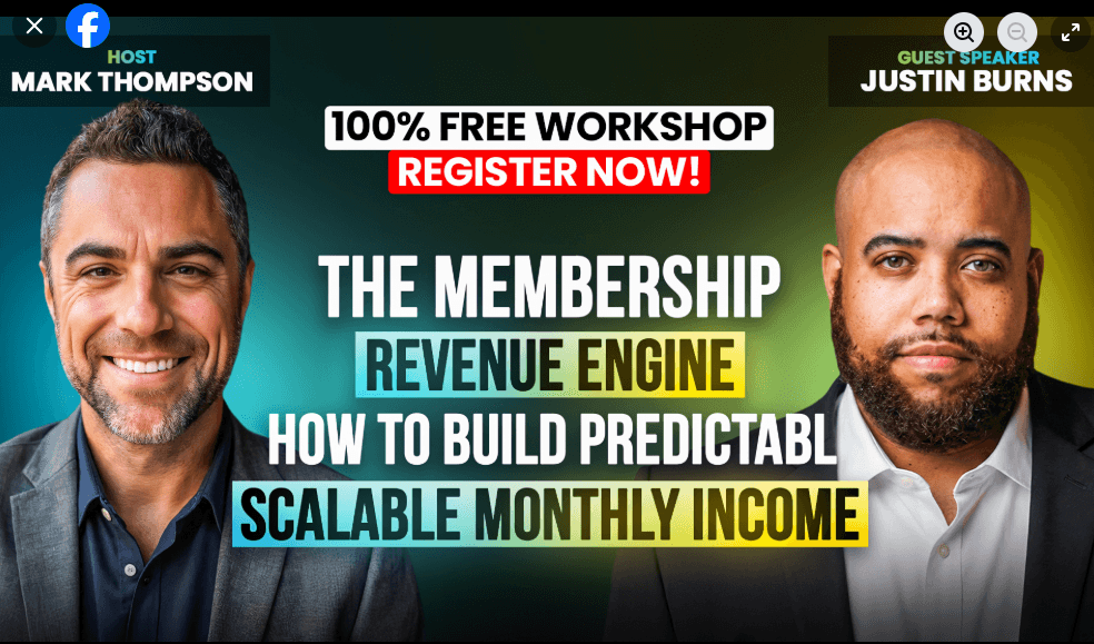
Check out this Facebook ad from PayKickstart:
Now, here is the landing page of that ad.
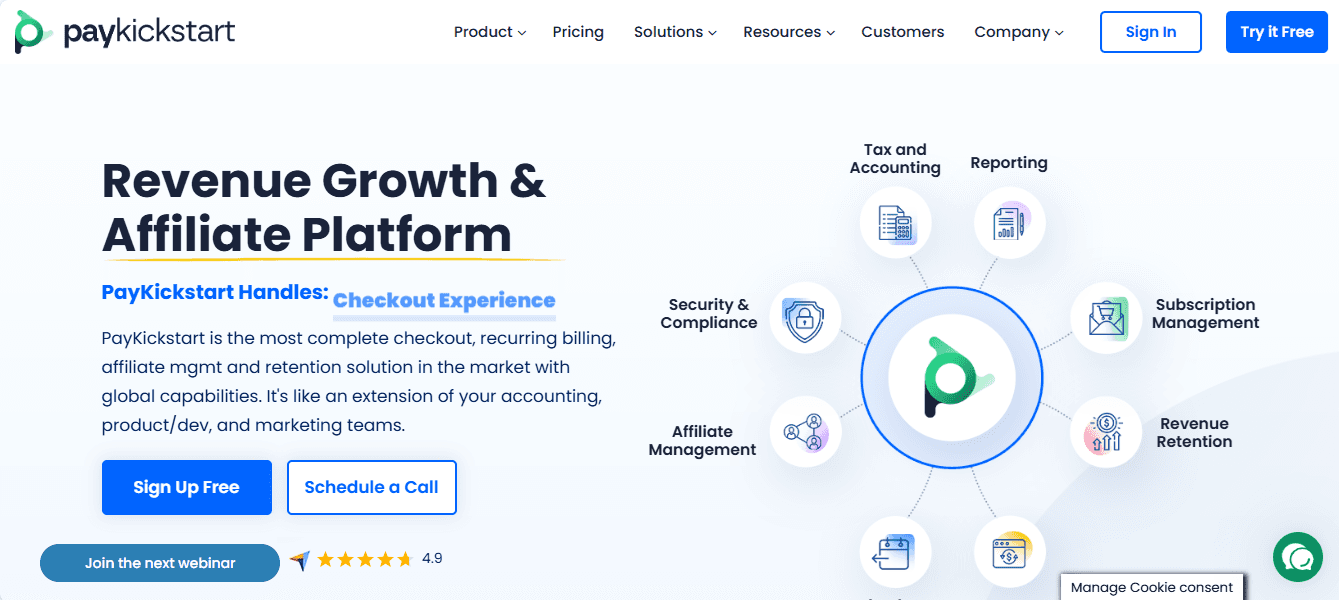
You can see that the same highlighted on the social ad is present on the landing page. In fact, it is used as part of the CTA. Also, the branding colors are consistent. And if you scroll further down the page, you will notice the first testimonial highlighted is of the two BodyFX founders captured in the ad.
Consistent brand messaging delivers a smooth customer experience. That, in turn, can help reduce bounce rate and improve conversions. Just like you’d want the look of your business card to match the overall branding of your company, your landing page should mirror the same consistency for a seamless experience.
2. Optimized for mobile devices
About 91 percent of social media users access these networks from mobile devices. Therefore, prospects will probably land on your social media landing page through mobile devices. The pages should, hence, be optimized for smartphones and tablets.
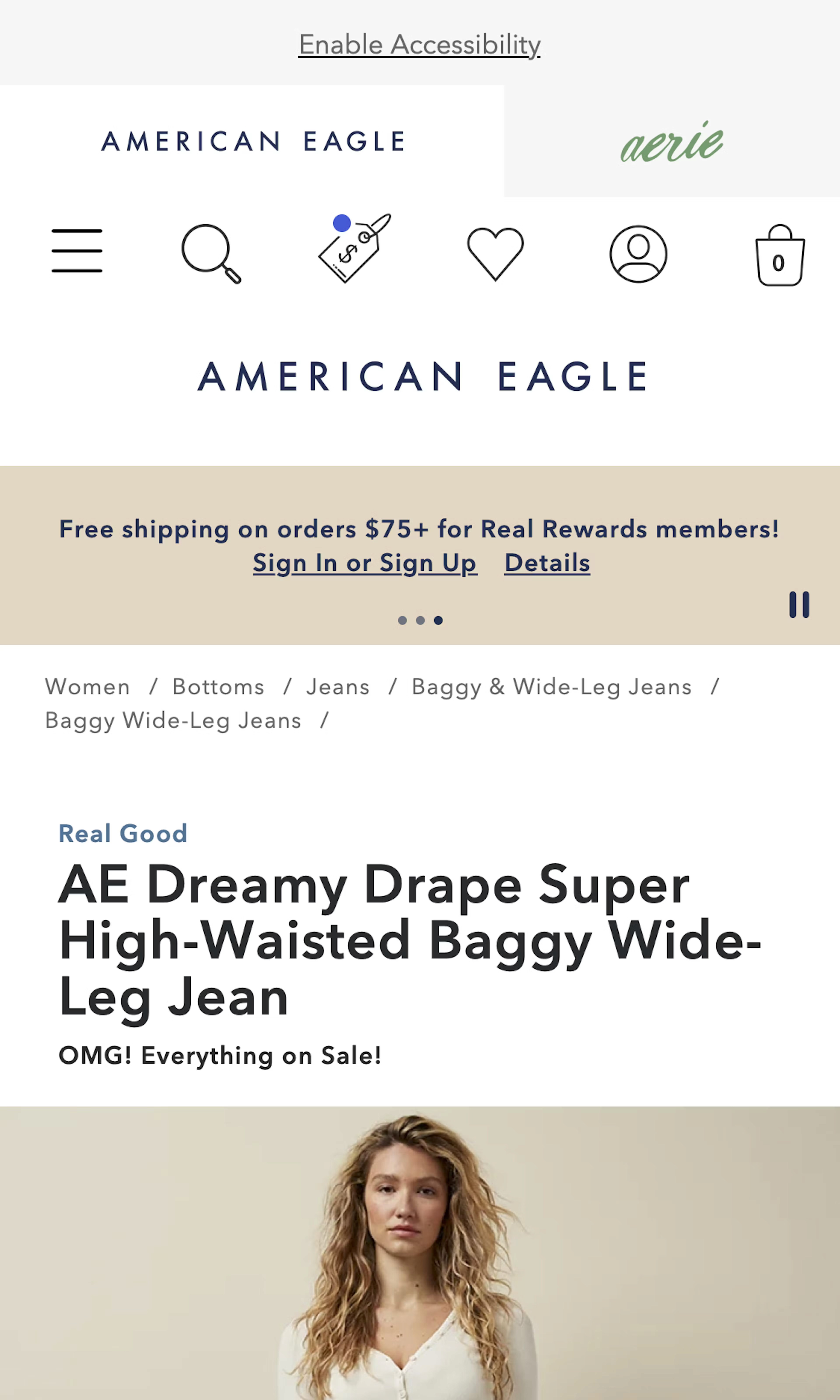
Make sure the text and images load properly. Users shouldn’t have to scroll horizontally to view your content. Spacing between text should also be sufficient for better readability. Your CTA button should be of a perfect size as well.
Also, you’ll be delighted to know that mobile friendliness can help your landing page rank better on search engines. It’s no wonder responsiveness is so critical not just for B2C but also for a good B2B web design.
Most landing page builders create mobile-ready landing pages right out of the box. Therefore, responsiveness shouldn’t be an issue if you create your page with the right tool.
3. Strong CTA
Getting your prospects to your landing page is one thing. Converting them into leads or customers is something else entirely. A strong CTA is one of those critical elements that can make all the difference on your landing page. Unfortunately, it’s also something that requires a lot of experimentation.
First, you’ll need to use powerful action words as your call to action. Words that will help visitors know what exactly is expected of them. You also want to keep it short and simple.
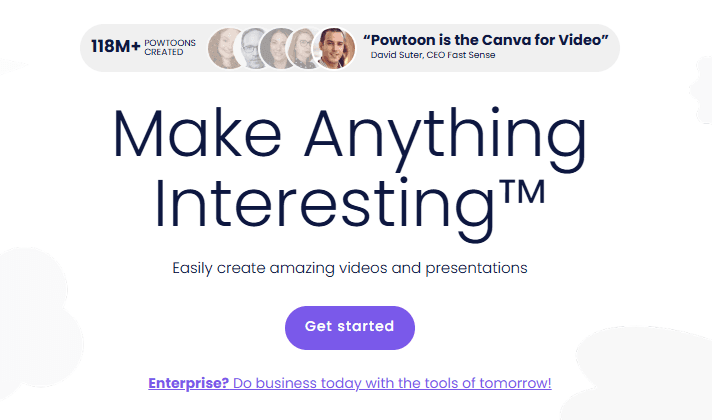
For example, an eCommerce website could use something like “Add to Cart” or “Add to Basket.” Meanwhile, SaaS companies could use “Get Started,” “Sign Up,” etc. A consulting company or a service business could use “Request appointment” to direct the visitor to their business phone number or Calendly link.
It’s also common practice to include an offer within the CTA. So, for example, instead of saying “Get Started,” you could use “Get Started Free.” You can also pick some inspiration from this CTA on Curator landing pages:
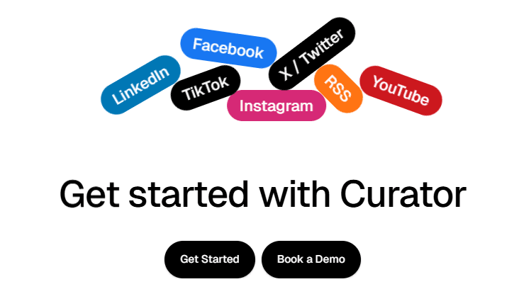
CTA button design and placement are also critical. For the design, use a color that contrasts with the background. This allows the button to stand out, making it easier for the prospect to know the next step. As for the placement, you’ll need to put a button above the fold, just below the headline and main description of the landing page. The curator landing page CTA above does so perfectly.
If you have a pretty long landing page, include the CTA at strategic places throughout the page. That way, prospects will be able to take the desired action without having to scroll all the way up.
As mentioned earlier, CTA is something you’ll have to test to determine what works. Don’t just assume you’ll get great results with a red button or “Sign Up Free” CTA because it has worked for other brands. You must run your own A/B tests (more on that later) to find the perfect call to action button for your unique audience.
4. Add social proof
Allowing existing customers to do the marketing for you is one of the best ways to increase conversion rates. This technique actually works in various places. From making social media ads to writing an effective about us page, you can always rely on user-generated content like testimonials to get the job done.
Modern consumers don’t trust brand marketers and salespeople that much. That’s why it’s imperative not to do all the talking on your landing page. Instead, give existing customers a voice by adding testimonials, reviews, or ratings to your landing page. This allows interested customers to see what results they could expect from your product based on the experiences of fellow customers.
It’s vital to use credible social proof. Don’t fabricate reviews or testimonials. That’s likely to do more harm than good—instead, source reviews from real users of your products.
If you’re a B2B business, consider linking those reviews and testimonials to a customer’s profile. For example, you can link to the reviewer’s social media profile on LinkedIn or Twitter. You can even link back to the customer’s website.
You could also embed the testimonials from third-party reviews sites like G2 and Trust Pilot.
The bottom line is the reviews need to be credible to serve their purpose. These reviews fill interested buyers with more confidence in your product, increasing the chances of conversion.
Also, be mindful of where the social proof is included on the landing page. Place a CTA closer to the testimonials as pictured above.
5. Make the layout simple
By the time someone lands on your social media landing page, chances are they are already interested in what you have to offer. Therefore, don’t make your landing page design any more complex than it needs to be.
Remember, landing pages are built with only one goal in mind. Therefore, do not include anything that doesn’t help achieve that goal.
Here is a quick checklist showing the necessary landing page elements:
A headline
A description. Keep your description brief but insightful. Also, focus on the product benefits and don’t use buzzwords.
Visuals. Add a video or several images that demonstrate the value of your product.
A crystal clear call to action button
Social proof
Also, avoid using too many colors or font types on your landing page. A good landing page is crisp and elegant.
Luckily, the best landing page builders come with templates to guide you through this process. Pick a relevant template and customize it to reflect your branding style and overall brand values.
6. A/B test your page
It’s highly unlikely that you will create the perfect landing page right away. And even if you do, you won’t know it’s perfect unless you compare its performance to another version. That’s why A/B testing is critical when building a social media landing page.
That said, you need to approach these split tests carefully. For starters, don’t test too many elements at once. That will make it harder to attribute the results to a specific element. It’s advisable to test not more than two elements at once.
Some of the things you need to test are:
CTA button color
The CTA text itself
CTA placement
Landing page headline
Value proposition or offer
The visual elements used
Testing and optimizing your landing page accordingly helps boost your conversion rate. You can use tools like Optimizely, VWO, or Crazy Egg to run these tests.
Conclusion
Your robust social media campaigns will only make a difference if the landing pages are optimized to help users cross the line. The six tips above cover what you need to do to create such a landing page.
In addition to optimizing a social media landing page, many marketers use retargeting to stay connected with visitors who didn’t convert on their first visit. Tools like Retarg can support this approach by helping bring users back to the page after initial engagement.
Once again, you need a consistent brand message, strong CTA, social proof, a simple layout, and a mobile-ready landing page. Finally, use split tests to ensure your social media landing page performs at its peak. Good luck!Ian Loew is a web entrepreneur and inbound marketing expert, and the Owner & Head of Business Development of Lform Design. After four years of helping Fortune 500 companies with MGT Design, Ian embarked on his freelance career before establishing Lform Design in 2005. He leads a team of creative professionals to deliver inspired online experiences via modern, responsive websites that reflect his clients’ core values. When not at the helm, Ian can be found mountain biking with friends or spending time with his family.
Previous post: