Website Footer Design Best Practices [+Tools and Examples]
Dayana Mayfield
on
Website Design
The website footer: a small but mighty design element of your website. Sure, it lives at the bottom of the page, but a well-crafted footer can do some heavy lifting—organizing important links, reinforcing your branding, and even driving conversions. It’s the closer in your website’s design lineup, and its consistency is relied upon by those seeking specific info.
You don’t want to disappoint with a poor footer design. That’s why best practices are here to help.
In this post, we’ll explore what makes a footer great, why it’s so important, and the best practices for designing one that wows your audience. Plus, we’ll share tools and examples to help you craft a footer that doesn’t just exist—it shines. Let’s get started!
What is the footer of a website?
The footer of a website is the section located at the very bottom of a webpage. While it might seem like a small design element, it plays a big role in wrapping up your website’s content and providing users with important information. Footers are typically consistent across all pages of a site, acting as a catch-all for links, contact details, branding, and other resources.
Think of it as a digital safety net—it’s the spot users scroll to when they can’t find what they’re looking for elsewhere. Whether they’re hunting for your contact info, legal disclaimers, or social media links, the footer ensures they don’t leave your site empty-handed.
Why are website footers so important?
Website footers might sit quietly at the bottom of a page, but their importance is anything but small. They act as a utility belt for your site, providing a final opportunity to engage users and guide them where they need to go. Here’s why footers are so crucial:
Improved user experience: A clear, organized footer allows visitors to find essential information without frustration. If someone scrolls to the bottom of your page, they’re likely looking for something specific.
Increased engagement opportunities: Footers are prime real estate for engagement tools. You can encourage users to subscribe to your newsletter, follow your social media accounts, or explore additional content.
Reinforces branding: Including your logo, tagline, or a branded design element in the footer gives your site a cohesive look.
Provides essential legal information: The footer is where visitors expect to find legal details like your Privacy Policy, Terms of Service, and cookie consent.
Enhances SEO: By including links to key pages and strategically incorporating keywords, your footer can contribute to your site’s overall SEO strategy. It helps search engines crawl your site more effectively, giving you an edge in search rankings.
Encourages navigation: For larger websites, footers can act as a secondary navigation tool. A condensed menu or sitemap in the footer lets users quickly jump to important sections, especially if they didn’t find what they were looking for at the top.
Supports global audiences: If your site caters to an international audience, your footer can offer language or region selectors, making it accessible to people from around the world. You can also add an international virtual number, allowing visitors from different countries to have a simple way to get in touch.
5 website footer best practices (with real examples)
After reviewing dozens of website footers, I noticed the same design principles appearing again and again. The best footers aren't necessarily the most elaborate. They simply make it easy for visitors to find information, reinforce the brand, and encourage the next step.
These five examples highlight the footer design practices I think have the biggest impact on usability and conversions.
1. Keep your footer organized with clear navigation
The best footers act as a secondary navigation menu. Instead of dumping dozens of links into one long list, group related pages into logical categories and create a clear visual hierarchy. Visitors should immediately understand where to find products, resources, company information, support, and legal pages.
If your audience is international or your site contains a large amount of content, this is also a good place for language selectors, search functionality, or other navigation tools without cluttering your primary menu.
Example: Figma
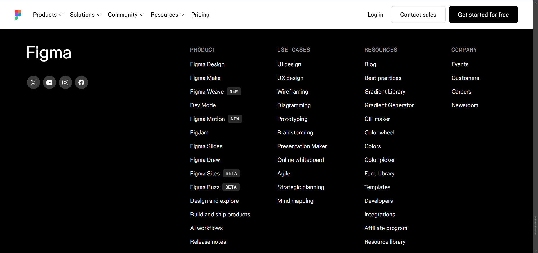
Figma's footer is one of my favorite examples because it organizes an enormous amount of information without feeling overwhelming. Product pages, templates, learning resources, community links, language options, legal pages, and social channels are grouped into intuitive categories. Even first-time visitors can quickly find what they're looking for.
What this example gets right:
Clear navigation hierarchy
Well-organized categories
Product and resource directories
Language selector
Legal and support resources
Social media links
2. Make it easy for visitors to contact you and build trust
Many visitors scroll straight to the footer looking for contact details, support resources, or company information. Make those items easy to find.
Depending on your business, this may include your email address, phone number, physical location, office hours, Help Center, shipping policies, certifications, accessibility information, or other trust signals. These details reassure visitors that your business is legitimate and easy to work with.
Example: MidwayUSA
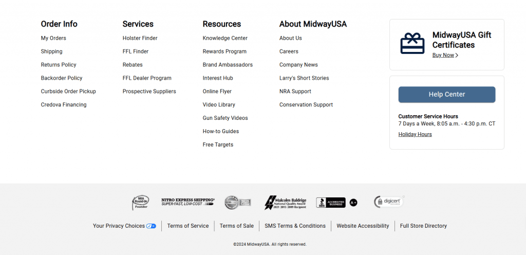
MidwayUSA's footer is built around helping customers find answers quickly. Navigation is organized into logical groups, while the Help Center, shipping policies, returns information, accessibility links, and certifications all reinforce trust.
What this example gets right:
Organized navigation
Easy-to-find Help Center
Clear policy links
Legal and accessibility information
Certifications and awards that build credibility
3. Reinforce your brand while adding a clear call to action
Your footer shouldn't feel disconnected from the rest of your website. Carry your branding all the way to the bottom through your logo, messaging, colors, or mission statement.
At the same time, don't waste the opportunity to generate another conversion. A newsletter signup, free trial, demo request, or similar CTA can perform well because visitors who reach the footer have already consumed much of your content.
Example: Patagonia
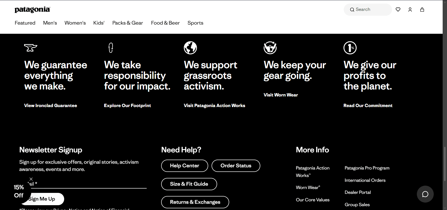
I like Patagonia's footer because it balances branding with usability. Customer support links, legal information, accessibility resources, and a newsletter signup are all presented alongside messaging that reinforces Patagonia's environmental mission. The footer feels like a natural extension of the brand rather than an afterthought.
What this example gets right:
Strong newsletter CTA
Mission-driven messaging
Consistent branding
Accessibility and legal resources
Well-organized navigation
4. Use your footer to keep visitors engaged
A footer doesn't have to be static. It can encourage visitors to continue interacting with your brand long after they leave the page.
Social media icon links remain one of the simplest additions, but many websites now go further by embedding a live Instagram or social media feed. This keeps the footer fresh, showcases recent content, and encourages visitors to follow your brand without requiring you to manually update your website. Social media widgets are also an effective way to repurpose content you've already created while keeping your website visually engaging.
Example: Petco

Petco's footer combines social media links with a newsletter signup, mobile app downloads, and organized navigation. Rather than ending the customer journey, it creates several opportunities for visitors to continue engaging with the brand.
What this example gets right:
Prominent social media links
Strong newsletter CTA
Mobile app download buttons
Organized navigation
Legal and accessibility information
5. Design every footer for usability first
The best-looking footer won't help if it's difficult to use. Good graphic design should support usability by keeping footer elements clear, organized, and easy to navigate.
Keep the design simple, responsive, and accessible across all devices. Use visual spacing to separate sections, maintain strong color contrast, optimize load times, and ensure the layout works just as well on mobile as desktop. Every design decision should make it easier for visitors to find information without unnecessary friction.
Example: Calvary Presbyterian Church
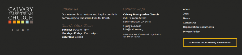
Calvary Presbyterian Church demonstrates how a relatively simple footer can still provide an excellent user experience. Contact information, office hours, social links, mission-focused branding, and a newsletter signup are all easy to scan because each section has a clear purpose. Nothing feels crowded, and visitors can quickly find the information they need.
What this example gets right:
Clear contact information
Office hours displayed prominently
Mission-focused branding
Newsletter CTA
Social media links
Clean, easy-to-scan layout
10 Tools to simplify and support your footer design process
Before choosing any footer design tool, think about what you want your footer to accomplish. Some tools are better for showcasing social proof, while others focus on email capture, accessibility, or design flexibility. We selected our top platforms based on the criteria below.
Selection criteria
Purpose-built functionality: Choose a tool that solves a specific footer need instead of trying to do everything.
Ease of implementation: Look for platforms that require minimal development and are easy for marketers to manage.
Performance impact: Prioritize lightweight tools that won't noticeably slow page load times.
Customization: Make sure the tool matches your branding, fonts, colors, and layout.
Mobile responsiveness: Check that footer elements look and function well on every screen size.
Accessibility: Select tools that support keyboard navigation, readable contrast, and semantic markup.
Integrations: Consider whether the platform works with your CMS, analytics, and marketing stack.
Long-term value: Choose a solution that will scale with your website instead of requiring replacement as your needs grow.
Here are the tools that made our list.
1. Curator: best for content aggregation and adding a live social media feed
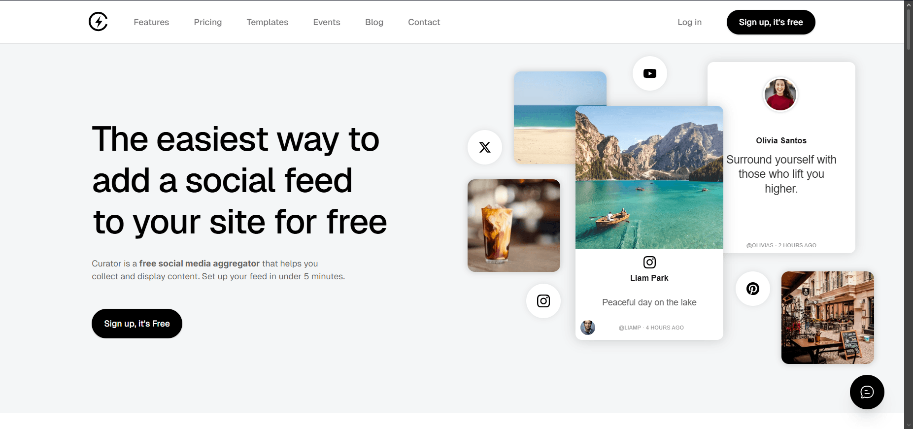
Curator's footer plugin is the best choice when you want your footer to show fresh, moderated social content. You can collect posts from key social platforms, approve the best content, and embed the feed with a simple code snippet.
I personally prefer it for showcasing active social channels, UGC campaigns, event content, or visual products in a website footer. Curator supports 15+ social networks and aggregation sources, including Instagram, Facebook, X, YouTube, LinkedIn, TikTok, Reddit, Google Reviews, RSS, and more.
2. Elementor: best for WordPress footer layouts
Elementor is best for WordPress teams that want visual footer control. Use it to build footer sections, adjust spacing, add forms, and manage responsive layouts without custom code.
Its drag-and-drop editor and layout controls make it especially useful for marketers who need to update footer sections without waiting on developers.
3. Mailchimp: best for footer newsletter signups
Mailchimp is a strong option when email capture is your main footer goal. Keep the form short. Ask for an email address only, then send people to a better onboarding flow after signup.
4. Hotjar: Best for understanding how visitors use your footer
Hotjar is the best tool for seeing whether people actually interact with your footer. Instead of only showing click data, it provides heatmaps, scroll maps, and session recordings that reveal how far visitors scroll, which footer links they click, and whether they ignore key calls to action.
I generally recommend Hotjar when you're redesigning a footer or testing new elements like newsletter signups, social feeds, or contact buttons. Watching real user behavior often uncovers usability issues that analytics alone can't explain.
5. Font Awesome: best for simple social icons
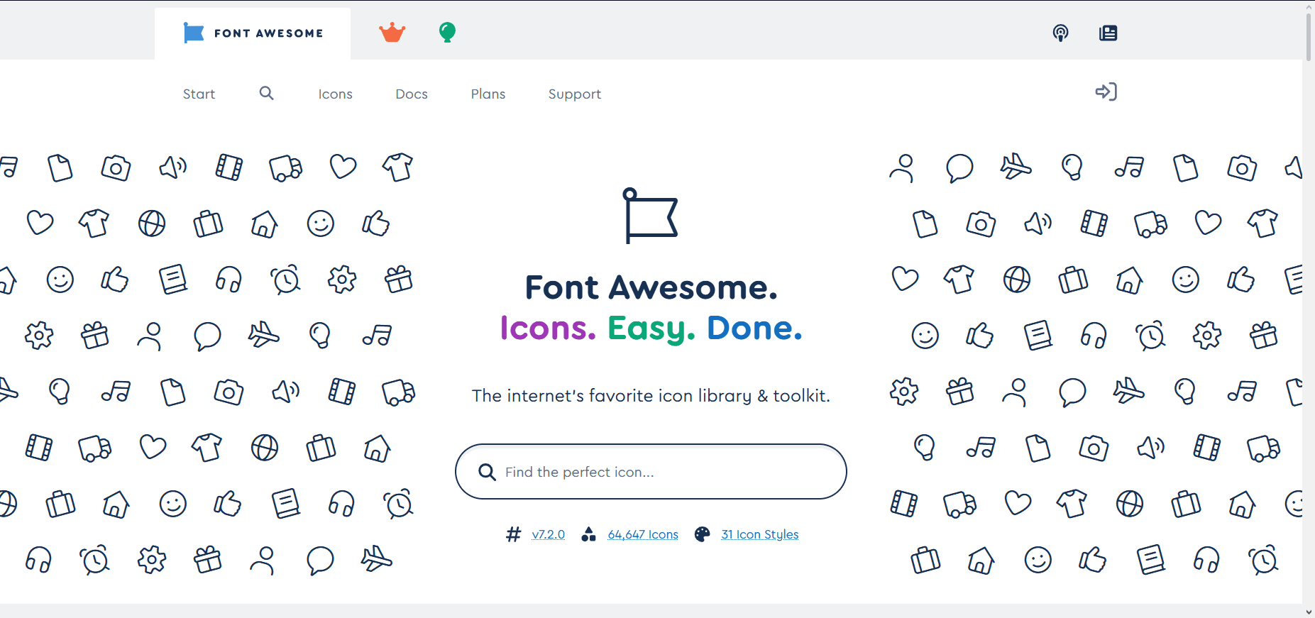
Font Awesome is useful for clean, consistent footer icons. Use it for social links, contact icons, app links, and small directional cues.
6. WebAIM Contrast Checker: best for accessibility checks
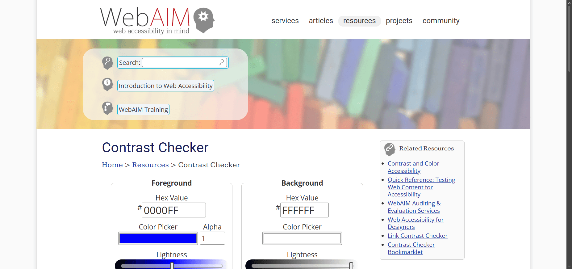
Footers often use dark backgrounds and small text. WebAIM helps you check whether those color combinations are readable.
Run every text, button, and icon color through a contrast check before publishing. The tool checks contrast for normal text, large text, and graphical user interface components.
7. Weglot: best for language selectors
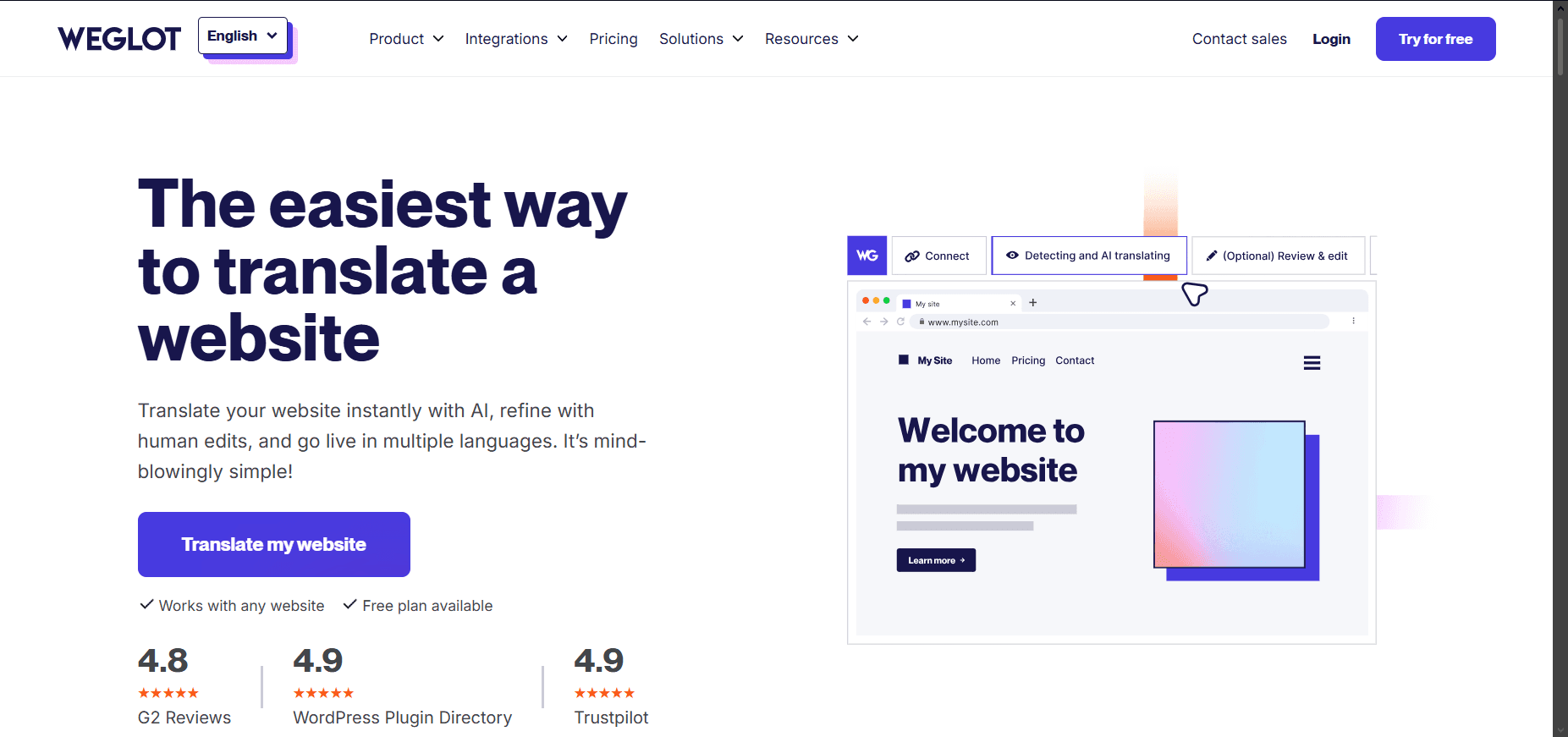
Weglot is useful when your footer needs a language selector. This is especially helpful for ecommerce, SaaS, and travel brands serving multiple regions.
Weglot supports multilingual website translation, works with many website platforms, and includes language-related SEO features.
8. Termly: best for legal and privacy links

Termly helps create and manage policies that usually live in the footer, such as attorney-crafted legal policies, cookie consent management, and privacy compliance support across major global frameworks. Use it for privacy policies, terms, consent banners, and other compliance links.
9. Canva: best for simple CTA graphics
Canva is best for quick footer CTA graphics, badges, and small visual assets. But I use it sparingly because a footer should stay focused on navigation and trust, not become another promotional banner. A simple icon, certification badge, or branded graphic can reinforce your message, but too many visuals quickly make the footer feel cluttered and distract visitors.
10. Font Squirrel: Best for free commercial fonts
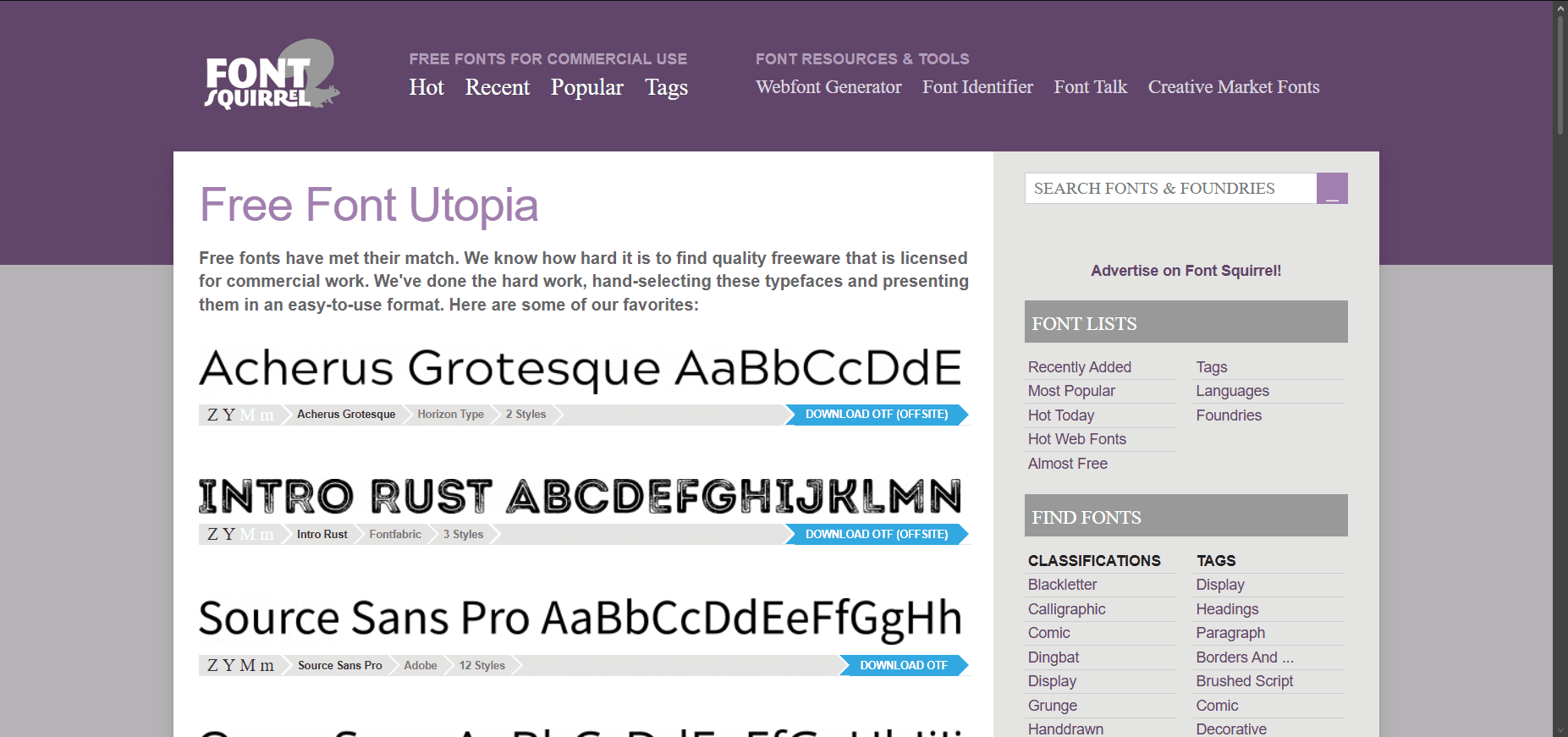
Font Squirrel is my top choice for website footers because every font is free for commercial use. Its curated library makes it easy to find readable, professional typefaces that keep footer links, contact details, and legal text clean, consistent, and on-brand.
Why use social media feeds as a footer engagement tool
Most website footer designs stay the same for months. Adding a live social media feed keeps the section fresh and gives visitors a reason to keep exploring instead of leaving your site. It also reinforces trust by showcasing recent customer photos, product launches, events, reviews, or behind-the-scenes content without requiring constant manual updates.
At Curator, we've seen that even a small, well-moderated feed can make a footer feel more engaging and authentic. I prefer displaying a hand-picked selection of my strongest posts instead of every update. A curated feed complements your navigation instead of competing with it. Because Curator's footer widget lets you moderate content before it goes live, you stay in control of your brand while giving visitors fresh, relevant content every time they reach the bottom of the page.
Want to add a social media feed like Instagram, X, or TikTok to your website's footer? Try our free forever plan.
Previous post: