Footers for Your Portfolio Website: What to Include, Design Tips and Examples
Dayana Mayfield
on
Nov 12, 2025
First impressions matter but so do last ones. On a portfolio website, the footer is often the final section visitors see before deciding to leave or take action. Though understated, this section plays a significant role in the overall user experience.
It can guide users, reflect your professional identity, and offer quick access to essential information. Whether you're a creative professional or freelancer, your footer should be both functional and thoughtful. In this guide, we’ll cover what to include, smart design tips, helpful plugins, and real-world examples.
Why footer matters on a portfolio website
When creating a portfolio website, most people focus on the top: the hero image, the projects, or the about section. But the footer matters just as much. It’s the part visitors see last, and it often decides what they do next.
A thoughtfully designed footer for your portfolio website can turn casual visitors into potential clients, collaborators, or employers. It does this in a few key ways.
1. Another chance to impress
First impressions are important, but lasting ones are even better. A clean, well-designed footer shows that you care about every detail of your site. It gives your portfolio a professional finish and leaves visitors with a positive final impression of your work and brand.
2. Improves navigation and user experience
Many people scroll straight to the bottom of a page when they can’t find what they need. That’s why the footer is such a powerful navigation tool. Adding links to your main pages like Home, Work, or Contact, helps visitors move around easily. A clear footer keeps users engaged and improves their overall experience on your site.
3. Helps with SEO
Good footer design isn’t just about looks. It also supports your site’s SEO. Including internal links in your footer helps search engines understand how your pages connect. This can improve crawlability and make it easier for your portfolio website to rank for important keywords.
4. Builds trust and credibility
Your footer is also a great place to show that you’re a professional. Simple details like your contact email, copyright notice, or links to social media accounts make your site feel more trustworthy. You can also include badges, memberships, or awards to show your credibility and experience.
5. Encourages action
Your footer can invite visitors to take the next step. Add a Hire Me button, a contact form, or links to your social profiles. This turns the end of the page into an opportunity to connect and convert interest into action.
6. Encourages return visits
Adding links to your social channels, newsletter, or blog helps people stay connected. A visitor who doesn’t contact you today might follow your work and return later. The footer becomes a bridge for long-term engagement.
What to include in a portfolio website footer
A good footer does more than fill space at the bottom of your site. It gives visitors helpful links, contact details, and ways to stay connected. Every element should serve a purpose. Here are the most important things to include in your portfolio website footer.
1. Contact information
Make it easy for people to reach you. Include your email address or a link to your contact page. If relevant, add a phone number or physical location. Clear contact details help potential clients or employers get in touch without searching through your site.
2. Navigation links
A footer for your portfolio website can act as a backup menu. Add links to your key pages such as Home, About, Work, Blog, and Contact. This helps users find their way around, even if they miss something in the main menu. It also keeps visitors exploring your site longer.
3. Social media links
Your social channels help show your personal brand and ongoing work. Add small icons that link to your social profiles. Keep them consistent in style and color with your overall design. These links give visitors another way to follow or connect with you.
4. Copyright and legal information
Always include a copyright notice with the current year and your name or brand. It shows professionalism and keeps your site looking updated. If needed, add a link to your privacy policy or terms of use.
5. Call to action
Encourage visitors to take the next step. You can invite them to contact you, view your latest project, or sign up for your newsletter. Keep the message short and friendly. A simple line like “Let’s work together” or “See my latest design project” works well.
6. Mini bio or tagline
Add a short sentence that sums up what you do. Something like “Freelance web designer based in New York” helps remind visitors who you are. It also supports SEO by including keywords related to your work and location.
7. Awards or memberships
If you have any awards, certifications, or professional memberships, include them here. These small touches add credibility and show that you take your craft seriously.
Design tips for an effective footer
A portfolio website footer should look clean, work well, and fit your brand. It should guide users without distracting them. These simple footer design best practices will help you create one that feels professional and polished.
1. Keep it simple
Less is often more. Use only the most important links and information. Too much text or clutter makes the footer hard to read. A simple layout helps visitors focus on what matters.
2. Match your brand style
Your footer should feel like part of your website, not an afterthought. Use the same colors, fonts, and design style as the rest of your site. This keeps your portfolio looking consistent and professional.
3. Use clear visual hierarchy
Make the most important items stand out. Contact details or a call to action should be easy to find. Use font size, spacing, and color to guide the user’s eye. A good hierarchy helps people quickly see where to click next.
4. Optimize for mobile
Many visitors view portfolios on their phones. Test your footer on different screen sizes. Make sure links are easy to tap and text is still readable. A responsive footer improves both design and user experience.
5. Keep load speed in mind
Large images, icons, or scripts can slow your site. Optimize footer assets for fast loading. A footer should never affect page performance.
6. Highlight your call to action
If your goal is to get hired or contacted, make that action clear. Use a short message and a bold button or link. A strong call to action at the bottom of your site can turn interest into results.
7. Use contrast wisely
A footer should stand out from the rest of the page, but not clash. Use a slightly darker or lighter background color to separate it from your main content. This helps users recognize it as the end of the page.
8. Keep text and links consistent
Use the same font sizes and link styles throughout your footer. Consistency makes it look more professional and easier to scan. Avoid mixing too many font weights or colors.
How to add a footer to your portfolio website
You can manually create a portfolio website footer using HTML and CSS, but if coding isn’t your thing, most site builders make it simple. Here’s how to add a footer on popular platforms:
WordPress (Block Editor or Page Builders)
Open your WordPress dashboard.
Go to Appearance > Customize and find the Footer or Widgets section.
Insert elements like text, menus, or social icons.
If your theme allows, tweak the layout and styling.
Click Publish to save changes.
NB: Using Elementor? Go to Templates > Theme Builder, create your footer, assign it to all pages, and publish.
Wix
Log into Wix and open the editor.
Scroll to the footer area of your site.
Click to edit and add text, links, or icons.
Customize spacing, layout, and style.
Save and publish.
Squarespace
Log in and open the editor.
Navigate to the footer on any page.
Edit existing blocks or add new content such as text, images, buttons, or code.
Use the design panel to style the footer.
Save your changes.
Shopify
In your Shopify admin, go to Online Store > Themes > Customize.
Open the footer section in the theme editor.
Add or update menus, social links, or newsletter signup forms.
Save to publish your updates.
Best examples of footers for portfolio websites
One of the best ways to design your footer is to see what others have done well. Looking at real portfolio websites can help you find ideas for layout, colors, and content. Each footer example has its own style, but the best ones share a few key qualities. They are clean, easy to navigate, and reflect the creator’s personal brand.
Below are a few common styles that work well for portfolio websites.
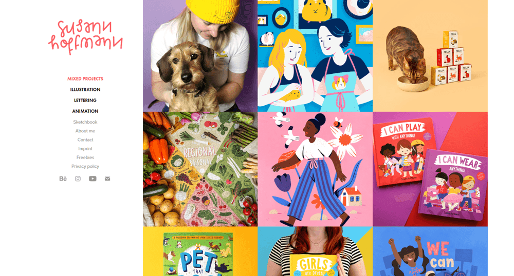
1. Minimalist footer
A minimalist footer focuses on clarity and simplicity. It often includes only contact links, a copyright line, and social icons. The clean look keeps attention on your work and feels modern.
This style works well for designers, photographers, or artists who want their projects to shine without distractions. Check out this minimalist footer example from Susann Hoffmann’s website.
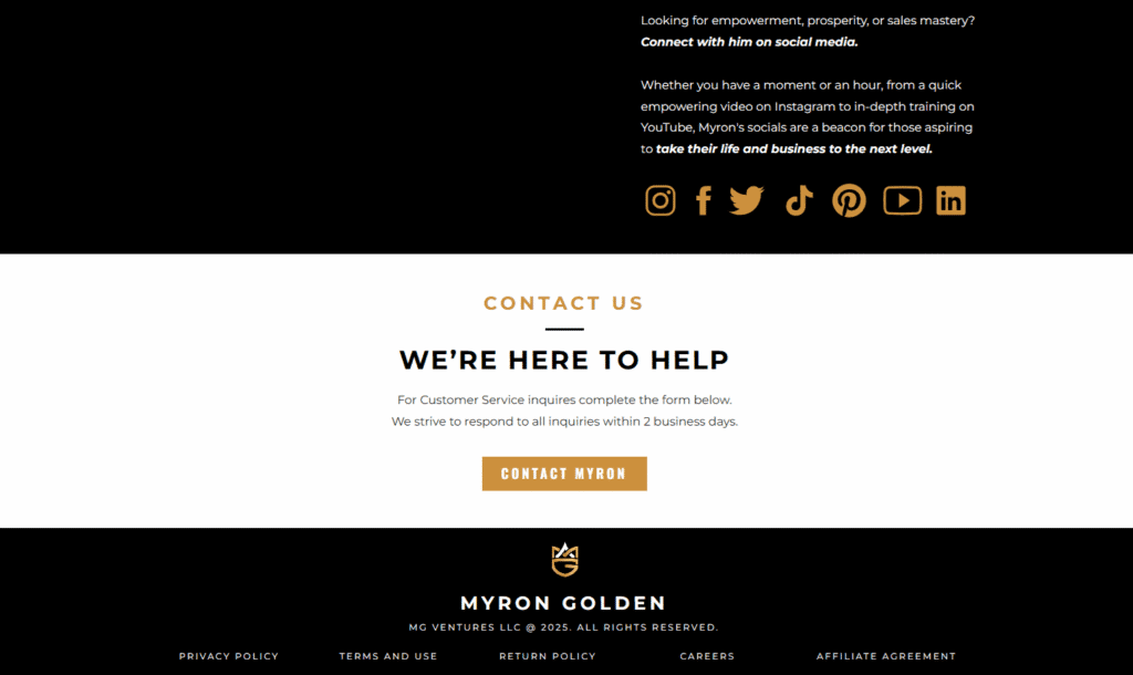
2. Information-focused footer
Some portfolios use footers to share more details. These might include short bios, location, awards, or a short message about availability. An information-rich footer gives visitors quick insight into who you are and what you do. It can make your site feel complete and professional. Check out this classic example of an informational footer from Myron Golden’s website.
3. Creative or interactive footers
Creative footers use animation, hover effects, or bold color to leave a lasting impression. A simple fade-in effect or a subtle scroll animation can add personality. These touches show design skill while keeping the footer functional. Just be sure any animation loads quickly and works on mobile devices.
Here’s a perfect example of a creative website footer from Samuel Day’s portfolio.

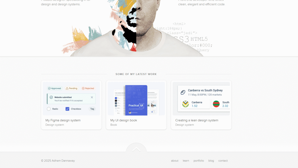
4. Image or gallery footers
Some creators use their footer as a mini showcase. They add a few small project images or a link to their latest work. This style works well for photographers, illustrators, and digital artists. It gives visitors a visual reminder of your talent before they leave the site. Adham Dannaway’s website showcases this beautifully.
Helpful footer plugins and tools
Plugins and tools can save time and help you create a footer that looks great and works well. Whether you use WordPress, Webflow, or Squarespace, there are many options that make designing and optimizing footers easier.
For wordpress
WordPress offers plenty of plugins for building or customizing footers for portfolio websites, including:
Elementor: Elementor is a popular page builder that lets you design footers visually. You can drag and drop widgets like text, icons, and buttons. It also includes templates that you can adjust to match your brand.
WPForms: WPForms is useful if you want to add a contact form to your footer. It is simple to set up and connects easily to your email or CRM system.
Sticky footer plugin: This plugin keeps your footer visible as users scroll. It helps when you want your call to action, like a “Hire Me” button, to stay on screen.
Footer mega grid columns: This plugin helps you create multi-column layouts. It is a good choice if you want to include several sections such as contact info, quick links, and social media.
For webflow
Webflow gives you full design control without code. You can use its built-in footer symbols to keep a consistent footer across all pages. Webflow also allows you to animate elements like icons or text, which adds personality to your site.
You can also embed social media feeds or project galleries using tools like Curator.io. This lets you display live updates from platforms like Instagram or Dribbble.
For squarespace
Squarespace includes built-in footer blocks. You can add text, images, forms, or social links quickly. Its design editor helps you match the footer style with your overall layout. For a more custom look, you can add small snippets of CSS to change fonts or spacing.
Other helpful tools
Canva: Use Canva to design custom icons or simple graphics for your footer. It is an easy way to keep your visuals consistent.
Color Hunt: If you want help choosing colors that match your brand, Color Hunt offers ready-made palettes that you can apply to your footer design.
Using these tools makes it easier to create a footer that looks professional and functions smoothly. Choose the ones that fit your platform and design style.
Common footer mistakes to avoid
Even a well-designed portfolio website can lose impact if the footer is done poorly. Small mistakes can make your site look messy or unprofessional. Here are common footer mistakes to watch out for and how to fix them.
1. Adding too much information
A portfolio website footer should guide users, not overwhelm them. Avoid adding long lists of links or large blocks of text. Choose only the most important items such as contact info, navigation, and social links. Keep everything short and clear.
2. Using tiny or hard-to-read text
Many visitors read the footer last, so small text can easily be missed. Use a clear font size and good contrast between text and background. This makes your footer easy to read on all devices.
3. Outdated copyright or content
Nothing says neglect like a footer that still shows an old year or broken links. Update your copyright date every year. Check your social and contact links often to make sure they still work.
4. Ignoring accessibility
Some designers forget that footers must be accessible too. Always use readable colors, keyboard-friendly links, and clear alt text for icons. These steps make your site easier for everyone to use.
5. Overusing visual effects
Animated or moving footers can look impressive, but too much motion distracts users. If you use animation, keep it subtle and smooth. The footer design should feel calm and polished, not noisy or busy.
Wrapping up: making your footer work for you
Your portfolio footer is more than just a space at the bottom of your site. It’s a tool to connect with visitors, share important information, and leave a lasting impression.
Remember to keep your footer clear and simple. Include essential details like contact info, navigation links, and social media. Use design tips to make it look good and fit your brand. Avoid common mistakes like clutter, tiny text, or ignoring mobile users.
Draw inspiration from real examples, and take advantage of tools or plugins to create a footer that’s functional and saves you time. A well-crafted footer can turn visitors into clients or collaborators, helping your portfolio stand out and showing that you pay attention to every detail.
Lastly, take your time to plan, design, and test your footer. This ensures that it feels like the finishing touch that completes your website, rather than a pointless afterthought.
Previous post: