Adding a Slack widget to your website can be a game-changer for both internal and external communications. Whether you're looking to showcase your company's culture, keep employees up-to-date with announcements, or encourage new sign-ups to a public Slack community, embedding a Slack feed offers a seamless way to bridge the gap between your website and Slack’s dynamic messaging environment.
This guide walks you through the simple steps to set up a Slack widget quickly, covering all the essentials from selecting the right tool to customizing your feed’s design. With an embed tool like Curator, you can easily moderate, filter, and display the right Slack messages on your site—whether for an internal dashboard, a team portal, or a landing page. Best of all, these tools require no coding, making it a straightforward setup that takes just a few minutes.
Ready to bring Slack conversations directly to your website? Let’s dive into the details and get your feed up and running!
What is a Slack widget?
A Slack widget allows you to embed a live Slack feed on your website, offering real-time access to specific Slack channels or messages. Unlike social media feeds that often showcase user-generated content to add visual appeal, Slack widgets are used to streamline communication and enhance engagement within a targeted audience. By embedding a Slack feed, you can create a space for either public or private conversations on your website, whether for internal updates, customer support, or community building.
Here are some top reasons to add a Slack widget to your website:
Internal announcements: Keep employees updated with announcements in one place, reducing the need for duplicate posts.
Support and issue tracking: Display real-time issue reports on a secure site, so teams can respond quickly to requests or problems. This is great for internal wikis and Sharepoint websites.
Showcase company culture: Give visitors a glimpse of your team’s interactions to boost engagement and attract talent.
Promote your private Slack community: Attract new members by previewing insightful conversations from your community's Slack channels.
3 free and affordable Slack widget tools
Finding the right Slack widget tool for your website can be simple and cost-effective. Here are three top options that offer powerful features to aggregate and display your Slack messages on your site—no coding needed!
1. Curator
Curator is a versatile social media aggregator that supports multiple platforms, including Slack, making it easy to set up a custom feed for your website in minutes
Features:
Moderation rules
Editable posts
Advanced filtering
20+ customizable templates
API access
Multiple layouts
Analytics and reporting
Pros and cons:
Pros and cons: Curator offers competitive pricing, excellent moderation features, and minimal branding on the free plan, so your feed integrates smoothly into your site’s look. However, note that pricing varies based on monthly view limits.
2. Walls.io

Walls.io is a flexible social wall platform that aggregates and displays content from multiple social media platforms. It’s designed for both internal and external events, as well as marketing and HR campaigns, helping brands engage audiences with a real-time content display.
Features:
Direct posts
Moderation tools
Multiple layouts
Interactive polls and reactions
GDPR and CCPA compliance
Custom branding options
Accessibility support
Pros and cons:
Walls.io is easy to use and ideal for creating interactive social walls, but it doesn't have a direct Slack integration. However, you can connect Slack and Walls.io via Zapier to automatically push Slack content to your wall, ensuring Slack messages can still be part of your social wall without a native Slack connection. This integration option makes it versatile, although it might require additional setup if you want real-time Slack updates on your wall.
3. Juicer

Juicer is an intuitive social media aggregator that brings together content from various platforms, including Slack, into a unified, visually engaging feed. It’s simple to set up and offers excellent customization options, making it a popular choice for businesses looking to showcase social media or community content on their website.
Features:
Direct Slack integration
Eight customizable design templates
Responsive design
Hashtag filtering
Content moderation
Automatic updates
WordPress plugin for easy setup
Pros and cons:
Juicer’s direct integration with Slack and diverse design templates make it an attractive option for embedding social feeds. However, the free plan includes noticeable branding, which can appear as Juicer ads on your site, potentially detracting from a professional look.
How to add a Slack widget to your website
Embedding a Slack widget on your website is a quick and easy way to enhance engagement, whether for internal updates, customer service, or showcasing a Slack community to new users. Here’s a step-by-step guide to setting up a Slack feed widget that aligns with your website’s goals.
Step 1. Select an accessible widget
To start, choose a social media aggregator that supports Slack integration, like Curator or Juicer. These tools make it simple to connect your Slack feed and customize how it appears on your website. A good widget tool will allow you to moderate and approve posts as needed, ensuring only relevant content is shown. The best tools are no-code, making them accessible to users with all levels of technical skills. Additionally, look for options with minimal branding on the free plans to avoid disrupting your site’s look.
Step 2. Create a new feed and select the moderation format
Once you’ve chosen a widget tool, log in to your account and create a new feed specifically for your Slack content. Most platforms will prompt you to name your feed, and you can select a moderation setting here as well. Typically, you have two options:
Automatic approval: Posts are added to your site automatically as they appear in Slack.
Manual approval: Each post must be reviewed and approved before going live.
For public sites, the manual approval setting is recommended to maintain control over what’s displayed. For internal sites or password-protected areas, automatic approval may be sufficient for an effortless, real-time feed.
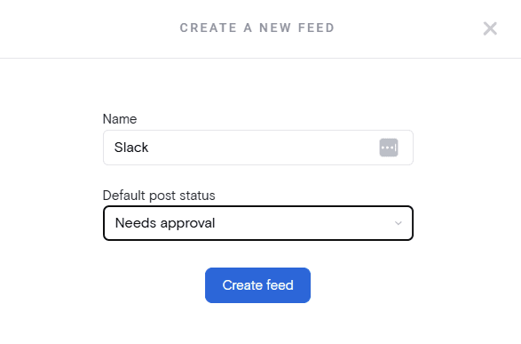
Step 3. Select Slack as the source and choose what types of channel feeds to display
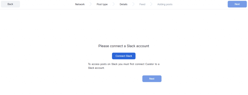
Next, set up your feed source by selecting Slack from the available options. You’ll need to connect your Slack account to the widget tool. This may involve authorizing the aggregator to access specific channels. Once connected, you can choose the Slack channels or types of messages to display on your website.
For instance, if your goal is to keep customers updated on your latest announcements, you might select only your “announcements” channel. If you’re showcasing community engagement, consider embedding your most active or on-topic channels.
Start by selecting Slack as the widget source.

Then connect your Slack account and login.
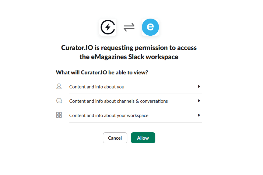
Lastly, allow the social media aggregator to have access to your Slack workspace so that it can read and display the content.
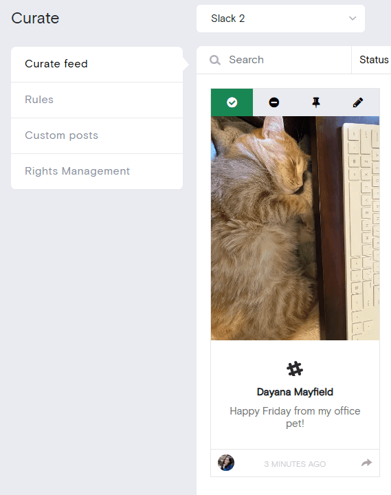
Step 4. Delete anything that you don't want showing up in your widget
With your Slack feed connected, it’s time to clean up the content. This step is especially important if you’re using automatic approval or displaying your widget publicly. Scan through recent messages in the feed to delete any posts that don’t align with your website’s purpose. Most aggregators provide simple tools for deleting or hiding posts, allowing you to remove irrelevant or outdated messages quickly.
Some tools also offer advanced filtering, allowing you to set up rules to automatically exclude posts based on keywords or message length. This step ensures a polished, purposeful feed.
Step 5. Choose a widget template and customize
Now, select a display template and customize the look of your Slack widget to match your website’s aesthetic. Widget tools typically offer templates like Grid, Waterfall, and Carousel. The Waterfall template, for example, is excellent for Slack feeds as it displays a combination of images and text in a clean, organized flow.
Customization options include:
Font and text size: Match these to your website’s typography.
Color scheme: Adjust text, icon, and background colors to blend with your branding.
Spacing and margins: Control the space between messages for a streamlined look. Experiment with these settings to create a Slack widget that is visually appealing and user-friendly.
Step 6. Add the widget to your website
With your widget configured, it’s time to embed it on your site. Start by generating the HTML embed code from your widget tool. You’ll simply copy this code and paste it into your website’s HTML where you want the Slack feed to appear.
Depending on your website builder, you may have options for where to place the widget:
WordPress: Go to your site’s Appearance settings to add the widget in a footer or sidebar, or use a custom HTML block on a specific page.
Wix or Squarespace: Use the “+Custom Code” feature to place the widget on the page or in your site’s footer.
Webflow or Shopify: Embed the code using custom HTML elements or within the appropriate page section.
Once embedded, the widget will automatically update with new posts according to your selected moderation settings, keeping your feed fresh without requiring you to reinsert the code.
Step 7. Approve or remove threads as needed
Once your Slack widget is live on your site, make it a habit to check in regularly for new messages that need approval or removal. If you’ve set the widget to manual approval, you’ll just need to log in to your dashboard now and then to decide which posts make the cut. Tools like Curator and Juicer keep it simple with an easy click-to-approve setup, letting you quickly scan through and keep the feed looking polished.
Staying on top of moderation is a great way to keep your widget focused and relevant. If your tool has notifications, consider enabling these to get a heads-up when there are new posts waiting for review.
By following these steps, you’ll have a Slack widget up and running that keeps your site dynamic and interactive.
5 tips for making the most of your Slack widget
Follow these best practices for a high-quality widget you're proud to share.
1. Focus on moderation
Keep your widget on-brand by setting up moderation rules or manually approving messages. This helps ensure only relevant, high-quality posts are shown on your site.
2. Showcase company culture
Embedding a “water cooler” channel on your hiring page can give potential applicants a glimpse into your team’s vibe, fostering connection and interest.
3. Highlight key announcements
If your widget displays updates or company news, use it on internal pages or customer portals to keep everyone in the loop without needing extra notifications.
4. Drive engagement with interactive channels
Display a Slack community channel on your homepage or landing page to let visitors see discussions in real-time, potentially encouraging sign-ups.
5. Keep visuals consistent
Choose a layout and color scheme that match your website's design for a seamless, professional look. Customizing templates and styles helps the widget blend effortlessly into your brand's aesthetic. If you plan on sharing your Slack widget with external audiences, encourage community members to write with on-brand messaging or use company-approved announcement images.
Create a Slack widget with Curator. Learn more and choose one of our free or affordable plans.
Previous post: